Preview image. Unlock full-res
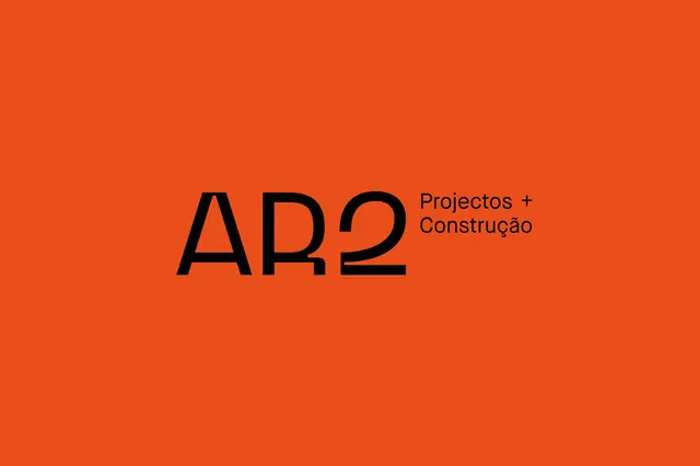
Large sans-serif logotype for a construction firm, pairing bold black type with warm burnt orange background and Portuguese service descriptor.
Summary
Bold display sans-serif acronym "AR2" in deep black anchored left, with Portuguese text "Projetos + Construcao" (Projects + Construction) right-aligned in smaller uppercase, on a vibrant burnt-orange ground.
Visual description
Centered composition on a solid burnt-orange background. Large, high-weight sans-serif characters "AR2" occupy the left-center, rendered in pure black. To the right, secondary service descriptor in smaller but still substantial sans-serif, also black, aligned to the upper-right quadrant. The typeface is geometric and contemporary, with generous spacing and no serifs. No other imagery or texture. The color contrast between black type and warm orange is maximum and deliberate.
Key takeaway
The confidence of pairing a single bold-weight typeface with zero decorative elements; the spatial rhythm of playing with different type sizes on the same line to create interest; the way warm and cool grays in the palette recede behind pure orange and black, keeping focus on type.
Reuse notes
Strong for construction, real estate, consulting, and engineering-sector brands needing authority without ornamentation. The burnt orange reads as energetic and practical. Works as a poster, identity system lockup, or single-page promotion. High contrast ensures legibility on most backgrounds if reproduced.
More like this
Keep what you find
A free account saves references to boards and can send you a weekly email of picks based on what you save.
To see every result, go Pro.