Preview image. Unlock full-res
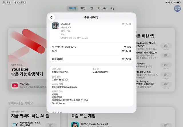
A clean mobile UI showing a card-based product list with a modal dialog overlay displaying detailed service information and Korean text.
Summary
A Korean-language fintech mobile interface showing a vertically scrolling product or service list with a white modal card overlaid, revealing investment or banking details.
Visual description
The main screen behind displays a scrollable list of cards in muted grays and whites, each entry representing a financial service or product (investment products, banking tools, or AI services visible). A modal dialog with rounded corners sits in the foreground, displaying a detailed service description including small profile image, Korean text headers, pricing (₩1,500), and metadata. The modal uses clear visual hierarchy: a gray header bar, white content area, and organized typography in sans-serif. Subtle color accents (soft pink or muted tones) may appear in badges or emphasis areas. The overall palette is cool, muted, and corporate.
Key takeaway
Modal windows over background content reduce cognitive load by focusing on one piece of information; the soft, muted palette conveys trust. Card-based layouts work well for financial products because each card is independently scannable. The hierarchy of headers, descriptions, and prices follows a predictable reading pattern. Using Korean text and local price notation grounds this in real-world fintech design.
Reuse notes
Essential pattern for fintech and banking apps presenting product catalogs or investment options. The muted color palette and spacious card layout work on small screens without overwhelming users. Works for investment apps, bank account management, insurance product selection. Scale modal to avoid covering all background context; allow some visibility of dismissed information for navigation clarity.
More like this




Keep what you find
A free account saves references to boards and can send you a weekly email of picks based on what you save.
To see every result, go Pro.