Preview image. Unlock full-res
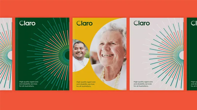
Healthcare brand identity for Claro, an aged care service, featuring radial sunburst graphics in contrasting colors with photography and sans-serif wordmark.
Summary
Brand system for Claro, an Australian aged care service, using radial sunburst motifs in warm and cool colors paired with portraits of service users and staff.
Visual description
A horizontal series of three card designs. Each card features a radial line pattern radiating from a focal point, creating a sunburst effect. Colors alternate between a dark forest green, warm coral-orange, and pale cream. Two cards include circular portrait photographs of smiling people (one man, one woman) positioned as the sunburst focal point; the third uses the radial pattern alone. The "Claro" wordmark sits in white sans-serif at the top of each card, with body copy below describing "High-quality aged care and disability services for all Australians." The overall composition balances geometric graphic strength with warm human imagery.
Key takeaway
The radial sunburst motif is a flexible, optimistic graphic that reads well both with photography and standalone. The restricted color palette (orange, green, cream, white) creates visual unity while conveying warmth and trustworthiness. The card structure scales across media and supports varied messaging while maintaining consistent brand presence.
Reuse notes
Strong template for healthcare, wellness, and community-service brands. The sunburst conveys care, energy, and openness. Works well in campaigns mixing portrait and abstract graphics. Color contrast is high enough to ensure accessibility and impact in digital and print. The system benefits from consistent portrait cropping and scale.
More like this



Keep what you find
A free account saves references to boards and can send you a weekly email of picks based on what you save.
To see every result, go Pro.