Preview image. Unlock full-res
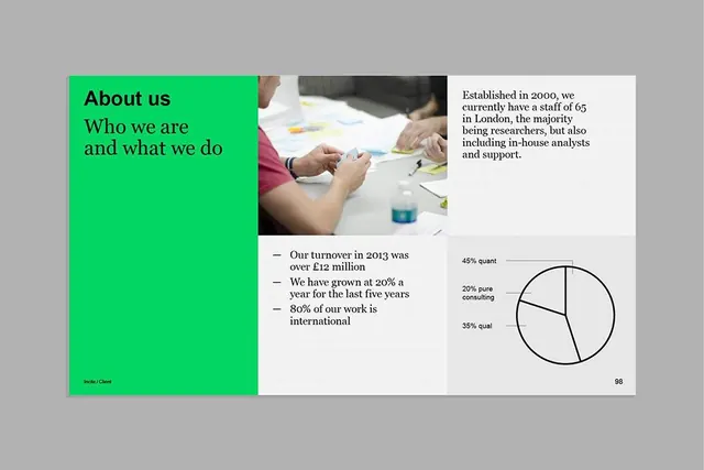
Split-panel About page with a neon-green accent column containing headline, research photograph in the center, organizational metrics and pie chart on the right.
Summary
Split-panel About page with a bright neon-green accent column on the left containing oversized headlines, a center-column photo of people in a research setting, and a right panel of body copy, bullet metrics, and a pie chart showing consulting mix.
Visual description
The layout divides horizontally into three vertical sections. The left panel is a solid, bright neon green (approximately #01D662) with black typography. "About us" is the top headline, followed by "Who we are and what we do" in a display sans-serif. A small "Brand / Client" label sits at the bottom left. The center column shows a cropped photograph of two people's hands holding documents at a desk, with blurred cups and papers in the background, conveying a working research environment. The right panel on off-white contains a block of serif body copy ("Established in 2000..."), three bullet points with key metrics (turnover, growth rate, international work %), and a simple pie chart with three segments labeled and tagged with percentages. Page number "98" appears bottom right. The type treatment and grid structure suggest this is a page from a corporate report or case study book.
Key takeaway
The neon-green left panel creates an immediate color anchor that breaks monotony without needing photography. The three-column split (accent, image, content) is a clean way to balance visual interest with information density. The pie chart label-and-percent placement is legible and compact.
Reuse notes
Works well for B2B About or case-study pages where you want a strong color statement alongside photo and metrics. The neon-green reads corporate-modern and pairs well with neutral-to-cool tones. Ensure photographs in the center column are sharp and contextual (hands, detail, activity) so they don't feel like stock filler. The layout assumes good vertical rhythm; watch column heights on smaller viewports.
More like this



Keep what you find
A free account saves references to boards and can send you a weekly email of picks based on what you save.
To see every result, go Pro.