Preview image. Unlock full-res
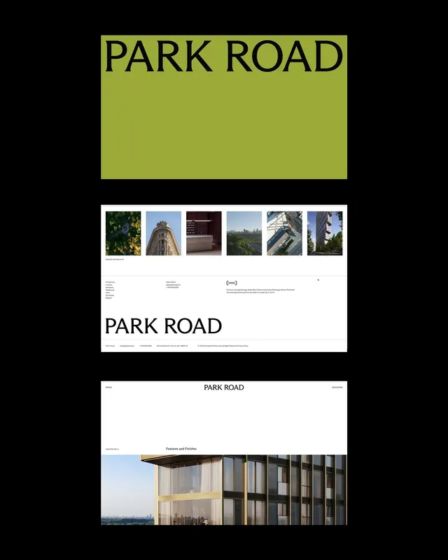
Multi-page brand identity presentation for Park Road using chartreuse and black with serif typography.
Summary
Multi-page brand identity presentation for Park Road using bold chartreuse title bars paired with black serif typography, photography portfolio pages, and modular grid layouts.
Visual description
Three pages from a brand identity system. Top: a chartreuse title bar housing centered "PARK ROAD" in large serif type on black ground. Middle: a portfolio page with six photography thumbnails (architectural and landscape), Park Road wordmark, navigation links, and footer credits on white. Bottom: a project detail page with left-aligned "PARK ROAD" in serif, navigation menu, and large architectural photography spanning a gridded layout. Throughout: high-contrast black/white with the warm chartreuse accent appearing on display elements. Serif typography dominates headings; sans-serif appears in captions and metadata.
Key takeaway
The confident pairing of a single high-saturation accent color against pure black and white creates a memorable brand mark without decoration. The modular grid system allows consistent hierarchy across vastly different page content types (title spreads, portfolios, detail pages) without repetition. The serif/sans-serif combination (serif for display, sans for body) is legible and architecturally grounded.
Reuse notes
Works for agencies, architectural studios, and design/portfolio projects seeking a bold, editorial identity. The chartreuse works best on white backgrounds and dark accents; avoid on images where it may fight. Scale the serif display type large for impact; it loses presence at small sizes. Pairs well with minimal photography layouts and grid-based content systems.
More like this



Keep what you find
A free account saves references to boards and can send you a weekly email of picks based on what you save.
To see every result, go Pro.