Preview image. Unlock full-res
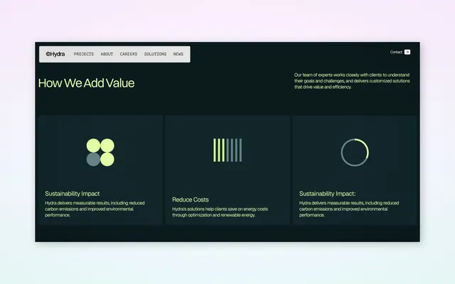
Consulting firm landing section in dark mode using lime-yellow accents, three abstract icons, and block-text body copy to describe service value pillars.
Summary
A B2B services landing section on a near-black background with a lime-yellow headline, body copy, and three minimal abstract icons representing sustainability and cost-reduction pillars.
Visual description
Dark navy-almost-black background fills most of the page. A horizontal navigation bar in cream sits near the top, showing the Hydra logo (white) and menu items (PROJECTS, ABOUT, CAREERS, SOLUTIONS, NEWS). Below, a heading in bright lime-yellow reads "How We Add Value" in a large, condensed sans-serif. To the right, off-white body text explains the company's approach in three lines. The lower two-thirds showcase three equally sized card blocks in a slightly lighter navy shade, each containing a different abstract icon in lime-yellow and teal: (left) four circles in a two-by-two grid, (center) six vertical bars in lime fading to gray, (right) a single open circle outline. Each card includes a short heading and paragraph text in light gray, describing a service pillar (Sustainability Impact, Reduce Costs, Sustainability Impact). The composition is perfectly balanced, with strong contrast between dark and light ensuring readability.
Key takeaway
The one-color accent (lime-yellow) against near-black creates maximum contrast and visual impact with minimal effort. The three-card layout with identical proportions and spacing feels organized and scalable. Simple geometric icons (circles, bars, rings) are abstract enough to work across industries yet concrete enough to suggest data and solutions. The headline-plus-description opening sets expectations before revealing the feature cards below.
Reuse notes
Excellent template for B2B consulting, sustainability, and enterprise SaaS landing pages. The dark mode conveys sophistication and trust, common in fintech and energy sectors. The three-column card pattern is infinitely reusable. Keep the accent color to one bright, contrasting hue; the discipline of restraint is what makes this design work. Pairs well with case studies and client logos further down the page.
More like this


Keep what you find
A free account saves references to boards and can send you a weekly email of picks based on what you save.
To see every result, go Pro.