Preview image. Unlock full-res
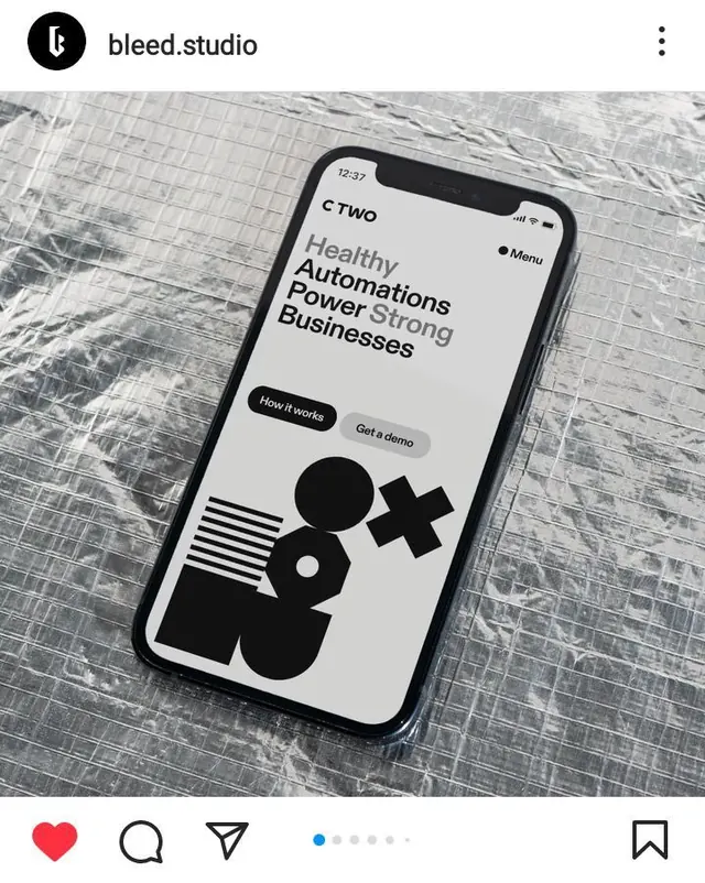
B2B SaaS landing screen mockup on an iPhone showing bold sans-serif headline, two-button CTA, and abstract geometric shapes (lines, circles, crosses, plus signs) in solid black.
Summary
iPhone mockup (product shot) of a B2B SaaS landing page featuring a bold headline, supporting copy, two CTAs, and a cluster of black geometric shapes (circles, lines, crosses, plus signs) as a minimalist product illustration.
Visual description
Physical iPhone displayed on a white wood-grain surface, tilted at an angle to show depth. On-screen: time stamp 12:37 in upper-left corner; "bleed.studio" header with three-dot menu in upper-right. Headline in heavy sans-serif reads "Healthy Automations Power Strong Businesses" on a light gray screen background. Below, two pill-shaped buttons: a solid black "How it works" CTA and a lighter ghost button "Got a demo." Below the buttons, four abstract geometric shapes arranged in a loose cluster: a solid black circle, a circle with a dot (compass or target), a black plus sign, and a black cross or X shape. The entire design is monochromatic, relying on weight contrast and negative space. Composition is clean and spacious, with generous padding around text and illustration.
Key takeaway
Abstract geometric shapes used as substitute for literal product screenshots or icons—faster to load, more scalable, less likely to become dated. The two-button pattern (primary + secondary CTA) creates a clear choice hierarchy. Heavy sans-serif headline paired with lightweight ghost copy leverages weight contrast instead of color. The shapes themselves (plus, circle, cross, target) suggest automation, interconnection, and data without needing to show actual UI.
Reuse notes
Ideal for B2B SaaS, automation, data, or enterprise software landing pages where you want to suggest capability without screenshot clutter. The geometric shape approach works best when the shapes are thematically tied to your value prop (plus = add feature, circle = cycle, cross = integration). High-contrast black-on-white is readable at small mockup sizes. Test the buttons on smaller screens (Android, smaller iPhones); the current pill buttons may shrink hard.
More like this

Keep what you find
A free account saves references to boards and can send you a weekly email of picks based on what you save.
To see every result, go Pro.