Preview image. Unlock full-res
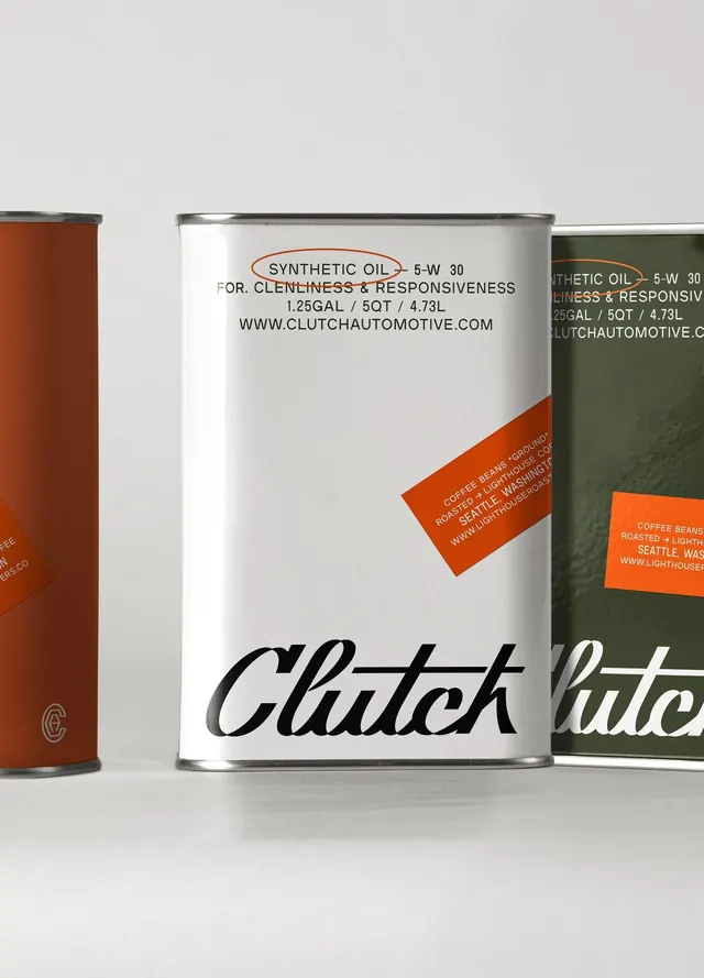
Three automotive lubricant cans in a stepped lineup: white center can, rust-red left, and olive-green right, with a continuous orange angled banner referencing coffee and Seattle branding.
Summary
Three automotive lubricant cans in a stepped lineup: white center can, rust-red left, and olive-green right, with a continuous orange angled banner referencing coffee and Seattle branding.
Visual description
Three cylindrical metal cans arranged in a left-to-right stepped composition against a neutral gray background. The center can dominates in white with black sans-serif text stating "SYNTHETIC OIL 5-W 30 FOR CLEANLINESS & RESPONSIVENESS" and "CLUTCH" rendered in large italic script at the bottom. The left can is a warm rust-red with the letter "C" embossed on the top half; the right can is olive-green with partial text visible. An orange angled banner spans across the right side of the center and left edge of the right can, containing references to coffee beans, roasting, Seattle, and a website URL. The layout emphasizes the distinct color identity of each product while maintaining visual continuity through the diagonal banner element and consistent metallic cylindrical form.
Key takeaway
The angled banner device creates a visual bridge across discrete products without requiring them to touch. Color-coding by product variant (red, white, green) allows instant SKU recognition on a shelf. The blend of technical spec text and lifestyle/origin storytelling (coffee, Seattle) makes functional industrial packaging feel approachable.
Reuse notes
Effective for a product line with multiple formulations or regional variants. The angled banner technique works for cross-selling or bundle grouping. Best applied to cylindrical or rectangular rigid packaging where the banner can physically wrap or overlap edges. Avoid for liquid pours or flexible packaging.
More like this



Keep what you find
A free account saves references to boards and can send you a weekly email of picks based on what you save.
To see every result, go Pro.