Preview image. Unlock full-res
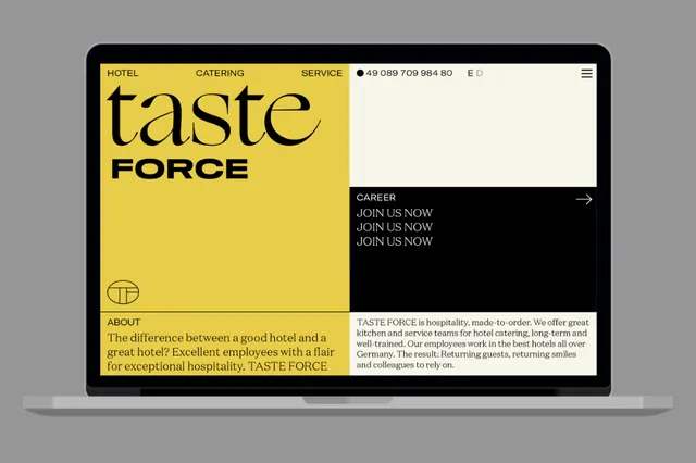
A two-column mockup for a catering company featuring bold mustard-yellow branding on the left side and a stark black right column with white text, linked by a central navigation header.
Summary
A two-column website mockup for a catering company featuring bold mustard-yellow branding on the left side and a stark black right column with white text, linked by a central navigation header.
Visual description
The design is presented as a rounded-corner laptop mockup on a gray background. The left half is bright mustard-yellow with black text. At the top sits a horizontal navigation bar in black with white labels: "HOTEL CATERING SERVICE" plus a phone number and language selector. Below is a large wordmark "taste" in a flowing display serif, stacked on top of "FORCE" in bold black capitals. A minimalist circular globe icon sits lower on the yellow. The bottom left contains a short "ABOUT" section in black type on the yellow. The right half of the screen is pure black with white sans-serif text. At the top is a white "CAREER" label with a right-pointing arrow. Below are three lines of white text reading "JOIN US NOW" repeated. Further down is a gray body-copy section describing the catering service. The entire layout respects a clear vertical axis, with content aligned left on yellow and left-aligned on black. Typography is crisp and modern throughout.
Key takeaway
The fearless use of maximum contrast (mustard against black) that feels bold rather than garish because of the generous white space and tight typography control; the split-hemisphere layout that lets each side breathe while staying unified through the navigation header; the restraint in decorative elements (just one icon, one logo, clean lines) allowing the color and type to be the design move.
Reuse notes
Excellent reference for B2B service brands (catering, consulting, hospitality) that need to feel both professional and approachable. The warm mustard reads as friendly and service-oriented, while the black lends seriousness. Works particularly well for brands that need clear section separation or a split message (e.g., client-facing on one side, career/internal on the other). Best applied at desktop scale where the split layout shines.
More like this

Keep what you find
A free account saves references to boards and can send you a weekly email of picks based on what you save.
To see every result, go Pro.