Preview image. Unlock full-res
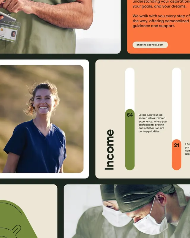
Healthcare service website layout using a four-cell grid with warm earth tones, human photography, and rounded accent shapes in orange and sage green.
Summary
A professional healthcare website wireframe organized as a 2x2 grid with alternating human photography, accent text, and rounded color-blocked shapes in warm sage and orange.
Visual description
Six content areas are arranged in an offset grid separated by dark charcoal strokes. Top left shows a cropped photograph of a hand with a medical ID badge and olive-green work shirt against white space. Top right contains orange color-blocked text ("understanding your aspirations, your goals, and your dreams") and a white pill-shaped button reading "anesthesiaoncall.com". Bottom left displays a portrait photograph of a smiling woman outdoors in soft natural light, wearing a dark navy top. Bottom right shows a cream background with a tall, rounded sage-green shape containing the number "64" in black bold sans-serif, alongside body copy. A smaller orange rounded shape sits lower with the number "21". The overall palette mixes beige, cream, charcoal, and warm earth tones, creating visual separation without harsh contrast.
Key takeaway
The restrained use of color: two accent colors (sage and orange) applied strategically to draw attention to key information. The rounded shapes add softness to an otherwise structured grid. The mix of human photography with content blocks creates approachability without sacrificing professionalism.
Reuse notes
Strong template for healthcare, wellness, or professional services websites. The grid structure is scannable and information-dense while remaining calm. The warm earth tones work especially well for patient-facing brands seeking to reduce anxiety. The photography-plus-graphic approach pairs well with testimonials or service breakdowns.
More like this



Keep what you find
A free account saves references to boards and can send you a weekly email of picks based on what you save.
To see every result, go Pro.