Preview image. Unlock full-res
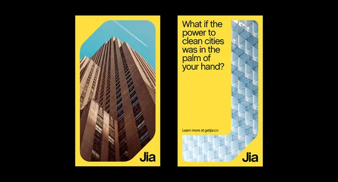
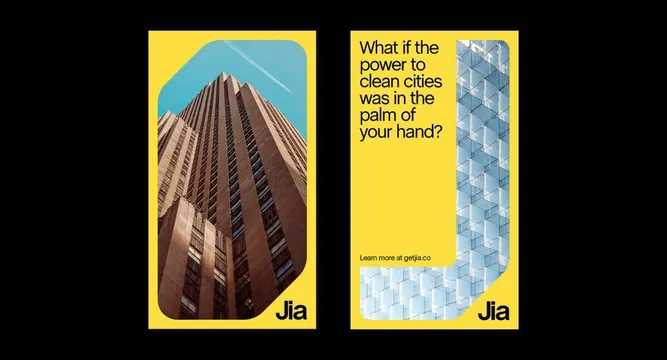
Two stacked rectangular cards with thick yellow borders: left card shows a converging architectural photograph of a tall building, right card displays a geometric blue-tinted grid pattern with brand text overlay.
Summary
Two brand identity cards with contrasting visual strategies: an upward-converging architectural photograph paired with a structural geometric lattice, unified by thick yellow borders and minimal sans-serif typography.
Visual description
Black background contains two rectangular cards side by side, each with a thick bright yellow border. The left card showcases a vertiginous photograph of a tall building shot from below, emphasizing linear perspective and upward motion in warm brown tones. The right card presents a blue and white diagonal geometric lattice pattern suggesting structure and precision. Both cards have small brand wordmark and descriptor text in the bottom left corner, rendered in clean sans-serif. The composition is perfectly balanced, with the organic complexity of the photograph counterweighted by the pure geometric grid.
Key takeaway
The pairing of photographic and abstract elements within a unified visual system, the thick yellow frame as a branding container, and the clean sans-serif anchoring both disparate visual styles.
Reuse notes
Strong for corporate or real-estate brands seeking visual sophistication. The yellow framing adds warmth without compromising formality. Works well in presentations and brand guidelines where both photography and geometric language are needed.
More like this



Keep what you find
A free account saves references to boards and can send you a weekly email of picks based on what you save.
To see every result, go Pro.