Preview image. Unlock full-res
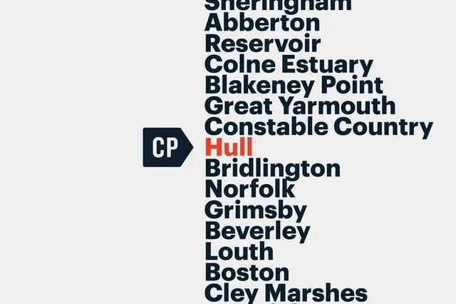
Minimalist directory list of UK regions set in stacked dark sans-serif headlines on light grey, punctuated by a navy arrow-badge containing initials.
Summary
Functional directory of UK regions rendered as a columnar list in bold dark sans-serif, with a navy arrow-badge containing initials interrupting the flow and a single place name accented in red.
Visual description
Light grey background with a single-column list of place names set in large, bold, all-caps dark blue/black sans-serif: Sheringham, Abberton Reservoir, Colne Estuary, Blakeney Point, Great Yarmouth, Constable Country, and others descending vertically. At mid-list, a small navy arrow-shaped badge with white initials "CP" interrupts the sequence. "Hull" appears in red text, creating a color break among the monochromatic names. The composition emphasizes clean typography and generous whitespace, with consistent line-height and left alignment creating a controlled, gridded appearance.
Key takeaway
The monochromatic palette makes a single color accent (red on "Hull") land with tremendous impact. The small, dense badge shape (arrow-badge) breaks visual monotony without adding visual weight. The consistent sans-serif weight and scale establish data-like authority, making it suitable for informational design. The structural simplicity makes scanning a long list effortless.
Reuse notes
Ideal for place-based indexes, regional directories, location services, or data-heavy interfaces (search results, filtering, categorized listings). The red accent technique works for highlighting a featured or primary item among many. Scale well to web and print. Avoid for consumer-friendly or emotive designs; the clinical typography reads institutional. Works especially well for travel, real estate, mapping, or organizational references.
More like this






Keep what you find
A free account saves references to boards and can send you a weekly email of picks based on what you save.
To see every result, go Pro.