Preview image. Unlock full-res
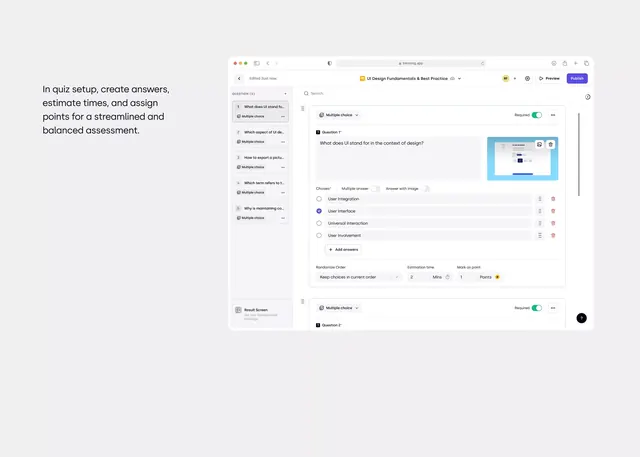
Minimal browser-based quiz or assessment interface with a two-column layout: sidebar question list on the left, main answer editor on the right, monochromatic palette with blue accents.
Summary
An educational assessment interface designed as a split-pane web application where left sidebar lists sequential quiz questions and right pane shows question details, answer options, point-weighting, and time estimation controls.
Visual description
Left sidebar: condensed list of numbered questions (1-6 visible) with "Multiple choice" labels. Left panel's label reads "In quiz setup, create answers, estimate times, and assign points for a streamlined and balanced assessment." Right pane: expanded view of "Question 1" with question text "What does UI stand for in the context of design?", radio-button answer options including "User Interface" (selected, blue dot), radio buttons for answer format choice ("Multiple answer", "Answer with image"), and a bottom section showing toggleable options (Randomize Order, Estimation time set to 2 mins, Mark as point: 1 point). Toolbar at top shows title "UI Design Fundamentals & Best Practice", Preview and Publish buttons. Monochromatic off-white, light gray (#B9BFC9), and charcoal palette with blue (#0066FF approx) for interactive states. Sans-serif throughout, generous white space.
Key takeaway
The split sidebar-plus-detail pattern, which scales well for any sequential, multi-answer scenario (surveys, tests, configuration flows). The right column's use of labeled sections (Choices, Multiple answer toggle, Randomize Order, Estimation time, Mark as point) shows how to organize many settings without clutter. The color restraint enforces focus on the functional content.
Reuse notes
Ideal for EdTech interfaces, testing platforms, and any form-builder where users need to both see a full list and drill into item details. The two-column layout assumes desktop width. The blue accent color can be swapped per brand; the structure stays neutral.
More like this

Keep what you find
A free account saves references to boards and can send you a weekly email of picks based on what you save.
To see every result, go Pro.