Preview image. Unlock full-res
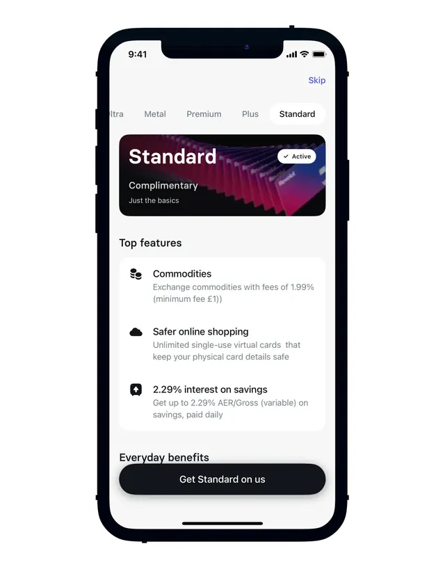
Mobile pricing plan screen with tabbed tier selection, a gradient-layered hero card for the active plan, and icon-labeled feature rows below.
Summary
A mobile pricing interface showcasing tiers via horizontal tabs, with a highlighted "Standard" card featuring a gradient visual hero and three icon-prefixed benefit statements below.
Visual description
iPhone frame (notch visible) on a light background displaying a white-ground pricing screen. Five tab buttons across the top (Infra, Metal, Premium, Plus, Standard) with "Standard" active. Below, a dark rounded card with "Standard" label and a white checkmark badge, containing italic gray sub-copy "Complimentary / Just the basics" layered over a vibrant magenta-to-blue diagonal gradient. Three feature rows follow: a coin icon with "Commodities" copy, a shield icon for "Safer online shopping," and a chart icon describing "2.29% interest on savings." Each row uses dark sans-serif headlines and gray secondary text. A black pill-shaped CTA button labeled "Get Standard on us" sits at the bottom. Clean spacing and icon-text pairing guide the eye downward.
Key takeaway
The gradient hero card creates visual distinction for the active tier without overwhelming the interface. Pairing simple monochrome icons with clear benefit headlines makes feature scanning effortless. The "active" state badge (checkmark) removes ambiguity about which plan is selected.
Reuse notes
Strong pattern for fintech, banking, or SaaS pricing screens where multiple tiers compete for attention. The gradient-on-dark approach works especially well when fintech credibility matters. Tab navigation works best for 3-5 tiers; more requires a different layout. The icon+text pairing scales to any feature set.
More like this




Keep what you find
A free account saves references to boards and can send you a weekly email of picks based on what you save.
To see every result, go Pro.