Preview image. Unlock full-res
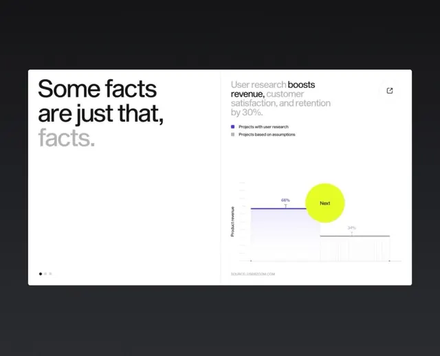
Presentation slide claiming user research boosts revenue, satisfaction, and retention by 30%, with a bold lime-green circular badge highlighting 'Next' and supporting bar charts.
Summary
Presentation slide asserting user research increases revenue, customer satisfaction, and retention by 30%, with muted color bars, a lime-green circular badge, and navigation dots at bottom.
Visual description
Left side displays large sans-serif text "Some facts are just that, facts." in dark gray and light gray. Right side shows a comparison bar chart with two categories: "Projects with user research" (purple bar) and "Projects based on assumptions" (gray bar). A legend explains each. Below, three colored bars represent metrics, with a 66% mark and a bold lime-green circle containing white "Next" text overlaying the right side. Small navigation dots appear at bottom left.
Key takeaway
Using a single bright accent color (lime-green) on a muted grayscale background creates emphasis and forward momentum. The circular badge format draws the eye and prompts action. Pairing a typographic assertion with supporting data visualization validates the claim without overloading the slide.
Reuse notes
Strong for research, UX, product, and analytics decks to justify investment in user-centered work. The lime accent works well for call-to-action or "next steps" messaging. Works best when the data bars are genuinely interesting; generic 60/40 splits feel less compelling.
More like this


Keep what you find
A free account saves references to boards and can send you a weekly email of picks based on what you save.
To see every result, go Pro.