Preview image. Unlock full-res
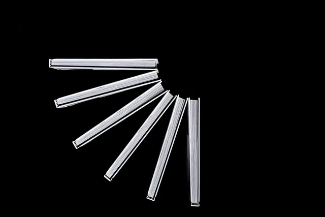
High-contrast grayscale composition with subtle mid-tones creating minimal, sophisticated visual balance.
Summary
A minimal composition in pure grayscale, balancing very dark gray against light gray, creating sophisticated contrast through restraint.
Visual description
A landscape-oriented composition (1400x934) rendered entirely in grayscale with minimal tonal range. The palette uses only very dark gray/black (#050505) and light gray (#C3C4C9), with likely intermediate grays creating subtle transitions. The design appears to be either geometric abstraction, typography treatment, or architectural photography rendered in monochrome. The lack of any color creates a technical, refined quality.
Key takeaway
How monochromatic palettes create sophistication through minimal means. The subtlety of gray-to-gray relationships creates visual interest without color saturation.
Reuse notes
Perfect for architectural, technical, or minimalist brand systems. Works for B2B companies, creative studios, or luxury brands seeking understated elegance. Excellent reference for understanding grayscale design systems or for projects that require color-neutral aesthetics. Good for accessibility-focused design or high-contrast interfaces.
More like this



Keep what you find
A free account saves references to boards and can send you a weekly email of picks based on what you save.
To see every result, go Pro.