
Preview image. Unlock full-res
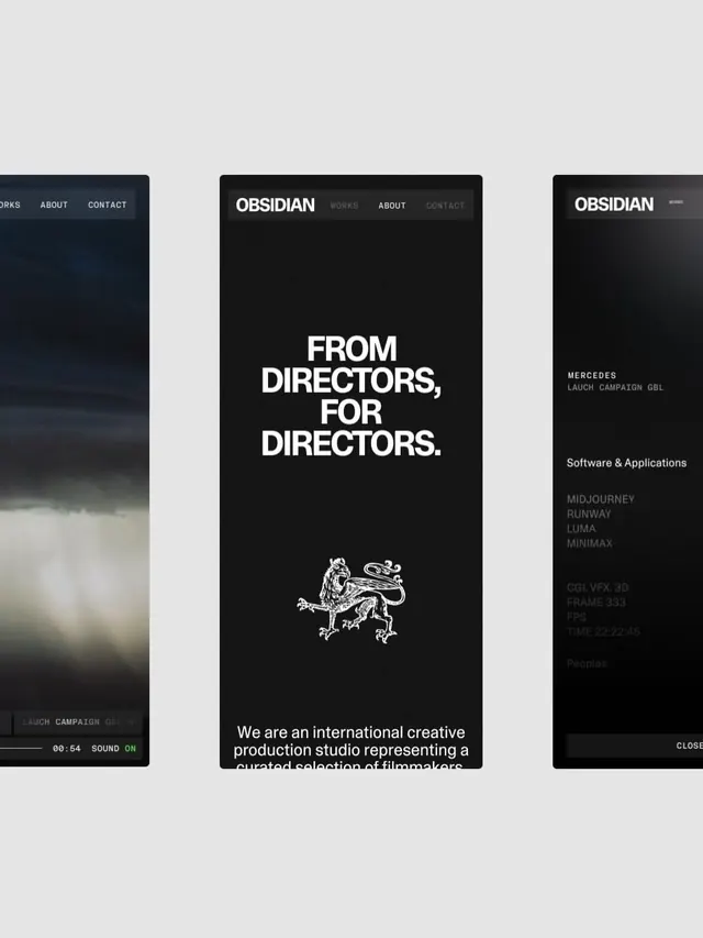
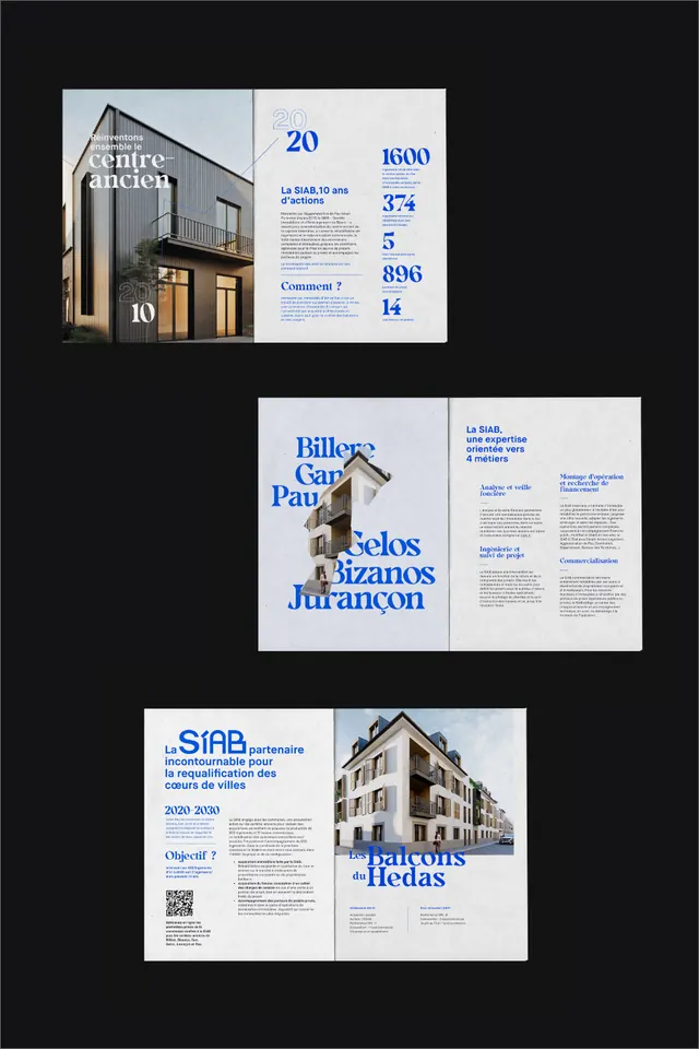
A typographic composition with layered text elements in varying sizes and weights, creating visual hierarchy through scale and spatial arrangement.

Summary
A typographic composition demonstrating visual hierarchy through varied type size, weight, and positioning, arranged in a vertical stacked layout.
Visual description
Large, bold heading text anchors the top. Below, a series of smaller text blocks sit in varying weights and sizes, creating a staggered, organic arrangement. The layout uses white space strategically to separate elements and guide the eye. Black and gray tones on white provide strong contrast. The interplay between serif and sans-serif typefaces (if mixed) adds visual interest without chaos.
Key takeaway
Hierarchy through scale is powerful and immediate—viewers instinctively read large text first. White space between elements is as important as the text itself.
Reuse notes
Excellent for editorial layouts, landing pages, or design system documentation. Demonstrates type pairing and spatial reasoning. Adaptable to diverse content by changing word count and type families. Works in both print and digital.
More like this




Keep what you find
A free account saves references to boards and can send you a weekly email of picks based on what you save.
To see every result, go Pro.