Preview image. Unlock full-res
A minimal, editorial-style landing page for a deep-tech company with oversized centered messaging, sparse navigation, and bold black-and-orange accents.
Summary
A minimal, editorial-style landing page for a deep-tech company with oversized centered messaging, sparse navigation, and bold black-and-orange accents.
Visual description
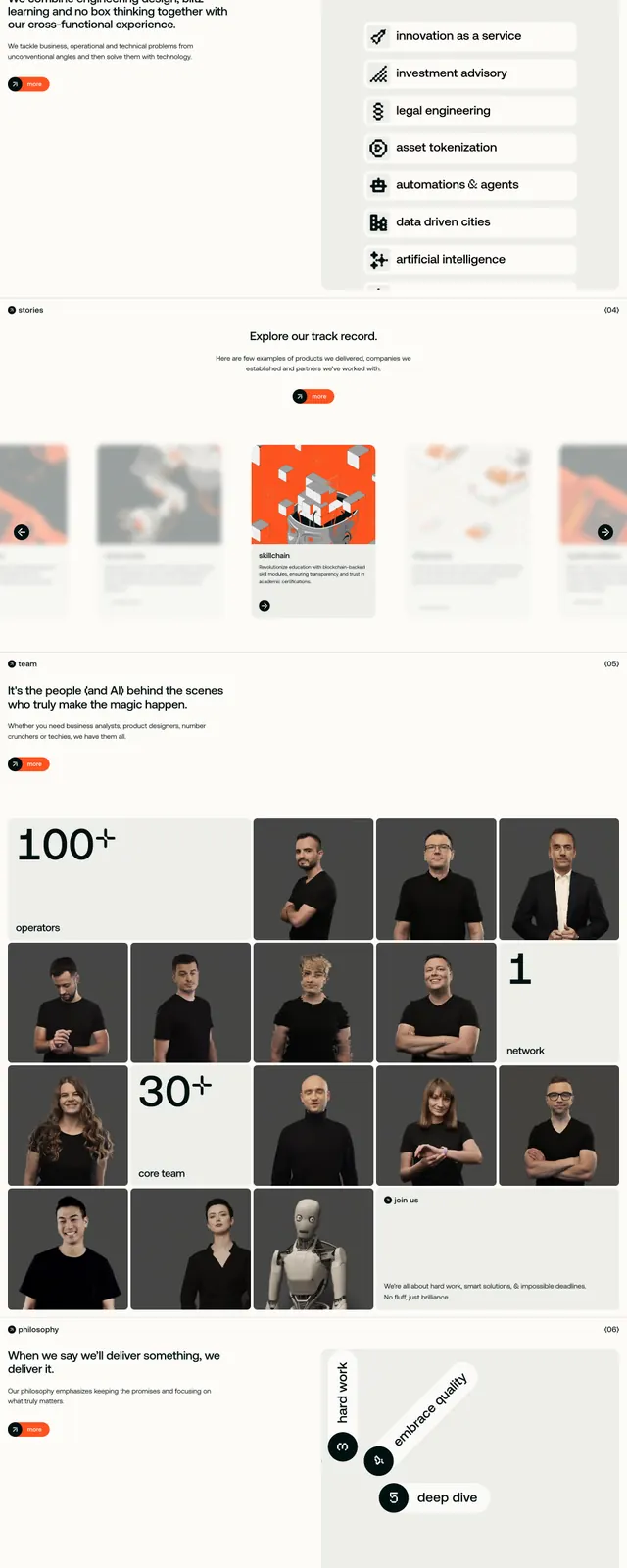
The page opens with a thin top navbar, small logo at left, centered text links, and a compact orange action button at the right. The hero is dominated by a very large centered headline in black sans-serif, a short muted subheading, and a small pill CTA beneath it, followed by a circular image area containing a glossy abstract brain-like 3D render. Lower slices show a horizontal carousel of cards, a team section with a large text intro and a grid of portrait tiles mixed with large numeric stat blocks, and a dark full-bleed CTA section with white headline text and a neon-like brain illustration.
Key takeaway
Use extreme typographic hierarchy with a restrained palette so the page feels sharp and confident. The mix of centered hero, card carousel, and bento-style team grid gives the layout variety without losing the minimal system.
Reuse notes
Works well for technical agencies, AI consultancies, or deep-tech brands that want to feel serious but not sterile. The approach depends on strong imagery and crisp spacing; without those, the layout can feel empty.