Preview image. Unlock full-res
A 6-slide UX research report template that bookends content with full-bleed periwinkle statement slides and runs an internal index of lime-numbered steps on soft lavender pages.
Summary
A clean, reusable UX research report template by Hrvoje Grubisic, built around one signature periwinkle purple and a lime-yellow accent. Its personality comes from the contrast between loud full-bleed statement slides at the start and end and quiet, structured content slides in the middle.
Visual description
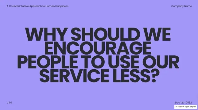
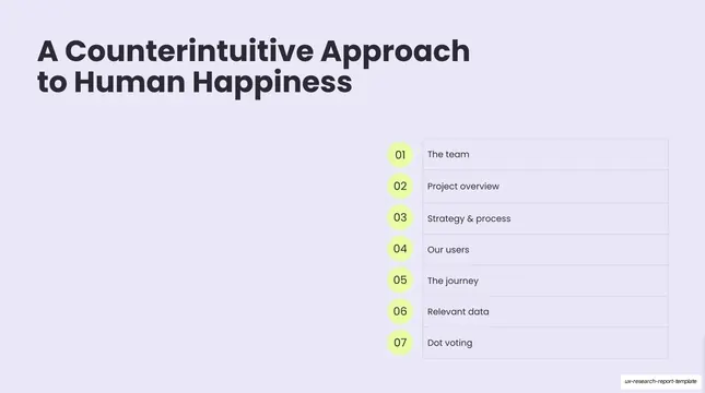
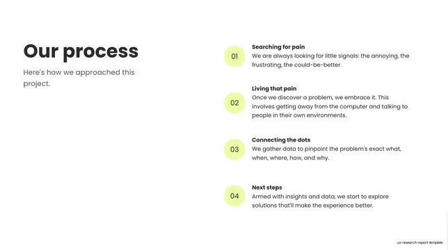
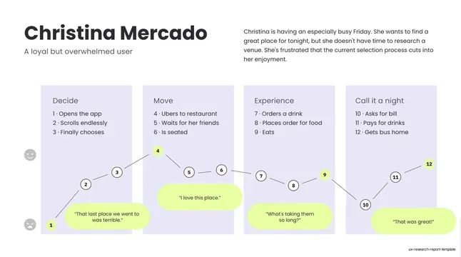
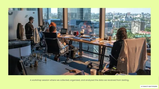
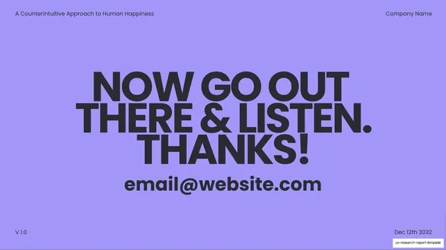
Slides run 16:9 in two distinct modes. Bookend slides (cover and closing) are full-bleed periwinkle (#9B8CF7) carrying an oversized, all-caps, heavy geometric grotesque headline in near-black, with tiny utility text pinned to the four corners: a running title top-left ("A Counterintuitive Approach to Human Happiness"), "Company Name" top-right, "V 1.0" bottom-left, and a date bottom-right. Content slides switch to a near-white field faintly tinted lavender (#E8E6F5). They share a recurring grammar: a bold mixed-case headline set large in the upper-left (with optional muted sub-line), paired on the right with a vertical stack of items, each prefixed by a number sitting inside a soft lime-yellow (#D6F36B) circle. That numbered-circle motif repeats as an agenda table, as a process list, and as the milestone markers on a journey map. A persona slide widens to four lavender columns with a connected zig-zag emotion line and lime speech-bubble quotes; an imagery slide drops a full-width photo into a lime-yellow frame with a single centered caption beneath. Body type is a clean grotesque; the lime accent and periwinkle do all the color work against otherwise neutral grays.
Key takeaway
The bookend strategy: open and close on a saturated full-bleed color slide with one oversized all-caps line, and keep everything in between calm and white. The single lime-on-lavender numbered-circle component reused as agenda, process steps, and journey-map nodes, so one motif threads the whole deck. And the journey map that plots a numbered emotion line across four labeled phase columns with quotes attached at the highs and lows.
Reuse notes
A strong default for UX research readouts, case studies, and any structured report that moves through team, process, persona, and journey. The two-mode system (loud color bookends, quiet white content) keeps a short deck feeling designed without heavy decoration. The corner utility labels are placeholder ("Company Name", "V 1.0", a fixed date); swap them per project. Works on light backgrounds; the periwinkle-plus-lime pairing is the whole brand, so recolor deliberately if reusing.
From this deck: UX Research Report Template
View deck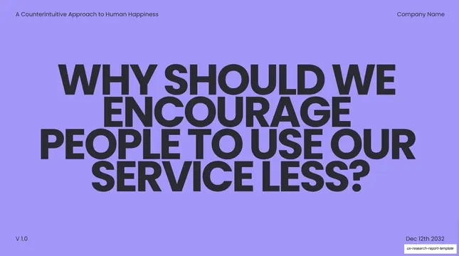
More like this







Keep what you find
A free account saves references to boards and can send you a weekly email of picks based on what you save.
To see every result, go Pro.