Preview image. Unlock full-res
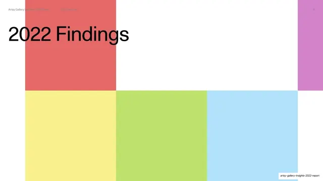
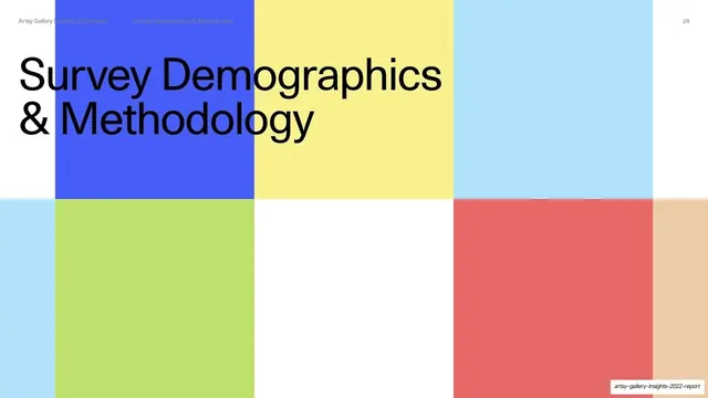
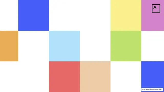
A section divider with the oversized headline "Key Findings" over a white grid carrying large blocks of pastel primary color.
Summary
A chapter opener: "Key Findings" set oversized in black across the top of a white grid that is filled with large rectangles of sky blue, yellow, lime, orchid and marigold.
Visual description
A white modular grid hosts several big flat color blocks placed at grid cells: a tall sky-blue column behind the title at left, a butter-yellow block upper-right, and a row of lime, orchid and marigold rectangles across the lower band, with white gaps between. The section title "Key Findings" runs across the top in oversized near-black grotesque sans, overlapping the blue block. The usual utility header sits faintly above it.
Key takeaway
Reusing the cover's scattered-color-block grid as a section divider, but enlarging the blocks and laying the section title across them. It signals a new chapter loudly while staying inside the established visual language.
Reuse notes
A strong recurring divider pattern for a multi-section report. Because it shares the cover's motif, it stitches the deck together. Vary which grid cells are filled per divider to keep each section opener feeling distinct without inventing a new layout.