Preview image. Unlock full-res
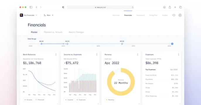
OG card showing a full-bleed tilted screenshot of a financial dashboard with charts, a timeline, and metric cards.
Summary
A product-forward card that is essentially one full-bleed, slightly tilted screenshot of a financial-planning dashboard, letting the charts do the selling.
Visual description
A browser window showing the "Financials" view of the Pry app fills almost the entire frame, rotated a few degrees and floating on a faint pastel gradient. Inside: a top nav with "Pry Financials," a "Master / Planned vs. Actuals / Recent Changes" tab row, and a horizontal date-range timeline with draggable nodes across 2020 to 2024. Below sit four metric cards: Bank Balances with a declining actuals-vs-planned line chart, Income vs. Expenses as a two-color bar chart, a Runway donut reading "22 Months," and an Expenses table of line items with dollar figures. Numerals are set in a monospace face; the palette is cool blues and whites with a yellow runway accent. No headline or wordmark beyond the in-app logo.
Key takeaway
Trusting a single clean dashboard screenshot, tilted and bled to the edges, to communicate a data product faster than any tagline. The yellow runway donut acts as a focal accent in an otherwise restrained UI.
Reuse notes
The right move for a fintech, analytics, or modeling tool whose value is legible in one screen. Works only if the dashboard is genuinely polished and readable at small sizes; crowd it and the social thumbnail turns to mush. Adding a one-line headline would help if the UI alone does not convey the category.
More like this

Keep what you find
A free account saves references to boards and can send you a weekly email of picks based on what you save.
To see every result, go Pro.