Preview image. Unlock full-res
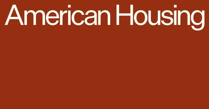
Minimal OG card with a cream wordmark set huge across the top of a deep rust-red field.
Summary
A spare two-tone card: the cream words "American Housing" set oversized across the top of a deep rust-red background, with the entire lower two-thirds left empty.
Visual description
A saturated brick-rust-red fills the whole frame. The brand name "American Housing" is set in a large cream-white sans-serif, running edge to edge along the top, slightly cropped at the left margin so the type reads as confidently scaled. Below it is nothing but open rust-red space. No imagery, icon, or secondary text; the contrast of warm cream type on the earthy red and the deliberate emptiness do all the work.
Key takeaway
Confidence through restraint: one oversized two-word wordmark, top-anchored, with a vast quiet field beneath it. The cream-on-rust pairing feels grounded and institutional, and the deliberate empty space reads as premium.
Reuse notes
A strong default for a real-estate, finance, or institutional brand that wants gravity without ornament. The whole effect rests on the type quality and the color pairing, so the palette must be chosen carefully. Reads cleanly at small sizes because there is only one element.
More like this





Keep what you find
A free account saves references to boards and can send you a weekly email of picks based on what you save.
To see every result, go Pro.