Preview image. Unlock full-res
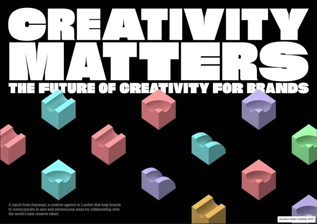
A 25-slide creative-agency trend report that alternates full-bleed poster slides of squashed condensed display type over vivid 3D pastel ball-maze renders with quiet serif editorial body-copy slides on black.
Summary
A 25-slide trend report from Anyways, a London creative agency, arguing that creativity is how brands win attention and rebuild trust. Its personality comes from two alternating modes: loud full-bleed poster slides where an oversized condensed display headline is vertically squashed to grip the top and bottom edges around a vivid 3D render, and calm editorial slides where multi-column serif body copy sits on flat black.
Visual description
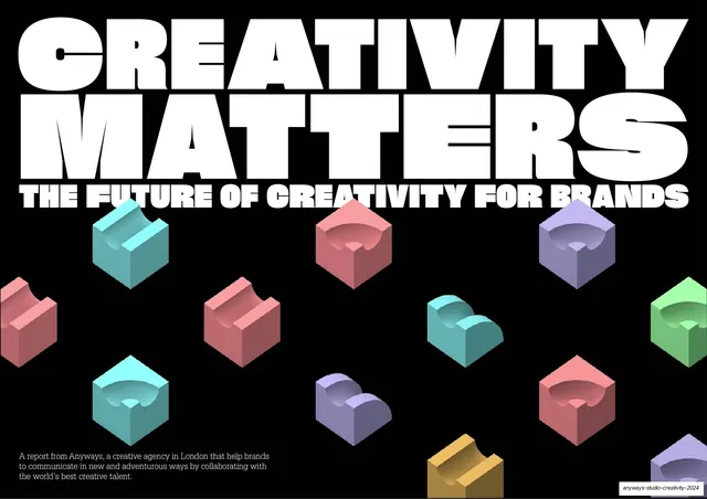
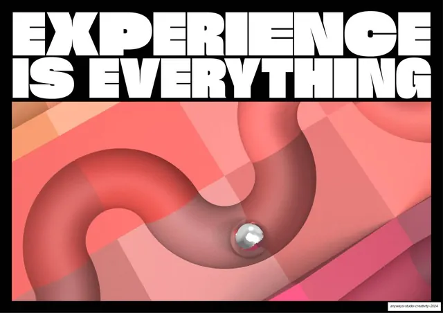
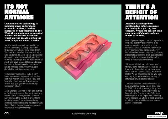
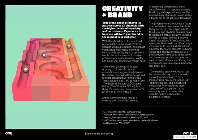
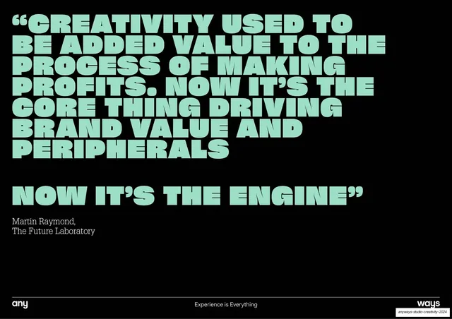
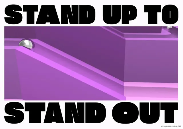
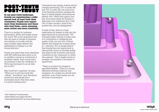
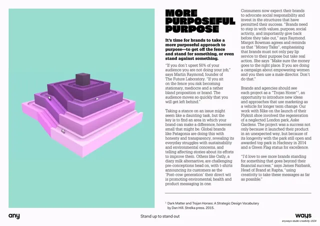
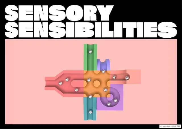
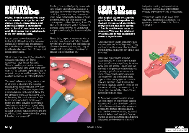
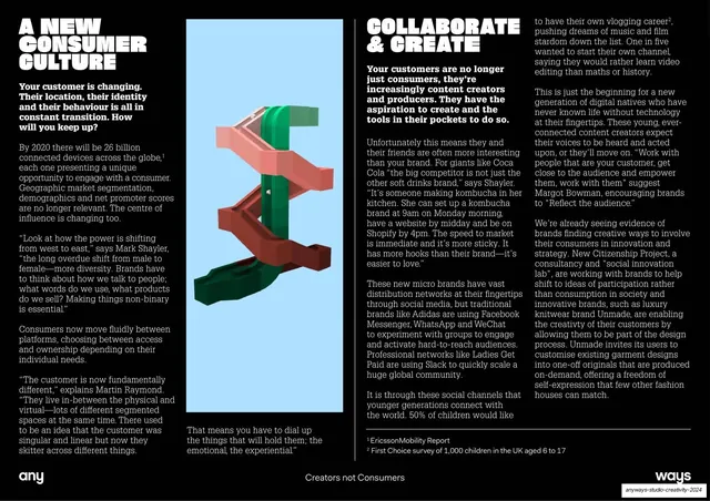
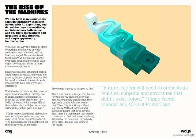
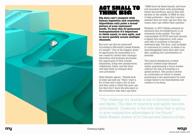
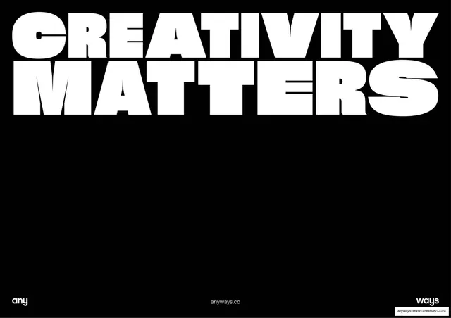
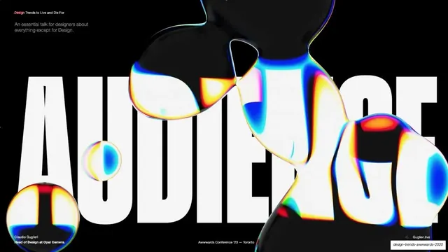
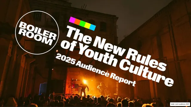
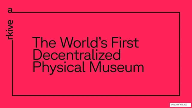
Slides run 16:9. The system is almost entirely black-and-white type with color carried by the imagery. Section-title posters use a heavy condensed grotesque display face set ENORMOUS and stretched flat, either in white on black or in black laid directly over a full-bleed image so the type and picture interlock. The recurring images are glossy 3D renders in candy pastels (coral, mint, lilac, sage, butter yellow) showing chunky channeled blocks, marble runs and chrome ball bearings, plus a few flat overhead "ball-maze" puzzles built from translucent overlapping color bars. Editorial slides drop the spectacle: a tight bold neo-grotesque kicker heading, then two or three columns of a quiet old-style serif at small size, with superscript footnote citations and a thin rule above the sources. A persistent footer runs across every slide on a hairline rule: a lowercase "any" wordmark bottom-left, a centered section label (Introduction, Experience is Everything, Stand up to stand out, Creators not Consumers, Embrace Agility, Contributors, A letter from our Managing Director), and a "ways" wordmark bottom-right, so "any...ways" brackets each page. Two pull-quote slides set a giant all-caps display quote in a single pastel tint (mint, pale blue) on black with a small serif attribution. The four-point summary uses outlined giant numerals (1-4) in a black bleeding-off panel paired with a clean bold neo-grotesque headline and an intro paragraph whose questions run through a pink-to-blue-to-green gradient.
Key takeaway
The two-gear rhythm: alternate maximal type-and-render posters with stripped-back serif text spreads so a long report breathes and never tires the eye. The signature move is the squashed condensed headline locked to the top and bottom edges of the frame, sandwiching a full-bleed image so word and picture share the same rectangle. The candy-pastel 3D renders give an otherwise austere black-and-white system all of its warmth and energy.
Reuse notes
A strong reference for trend reports, points-of-view, and creative-agency or media capabilities decks that want to feel art-directed rather than corporate. The poster-headline-over-render template and the outlined-numeral provocation layout are directly liftable. It leans hard on a distinctive squashable condensed display cut and on genuinely good 3D render art; with a generic typeface and stock imagery the whole effect collapses. Body-copy slides are dense, so it suits a reading document more than a stage-presented talk.