Preview image. Unlock full-res
A 31-slide youth-culture research report that pairs near-black slides with four rotating neon accents (lime, magenta, cyan, orange), ultra-condensed grotesque headlines, and rotated display pull-quotes over raw nightlife photography.
Summary
A 31-slide audience research report from Boiler Room on youth and club culture in 2025. Its personality comes from three moves: a near-black base lit by four rotating neon accents, ultra-condensed grotesque headlines, and rotated display pull-quotes splashed over raw nightlife photography.
Visual description
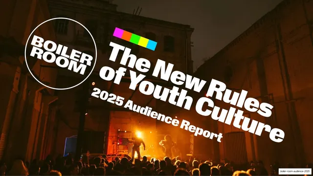
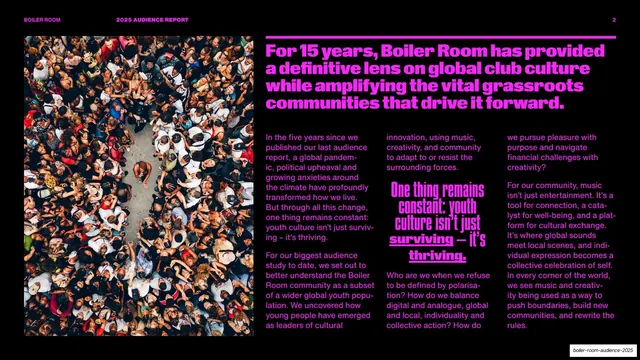
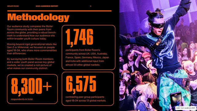
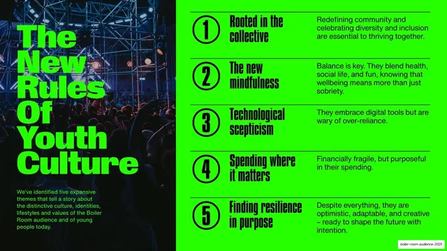
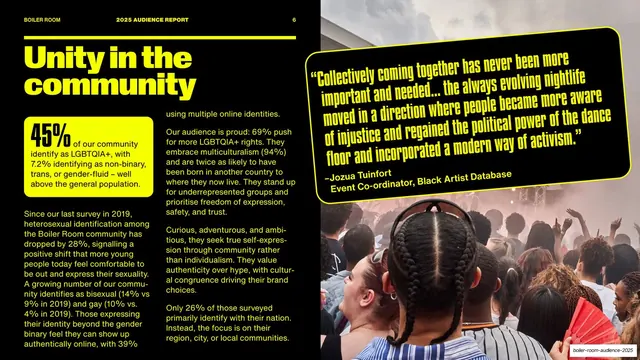
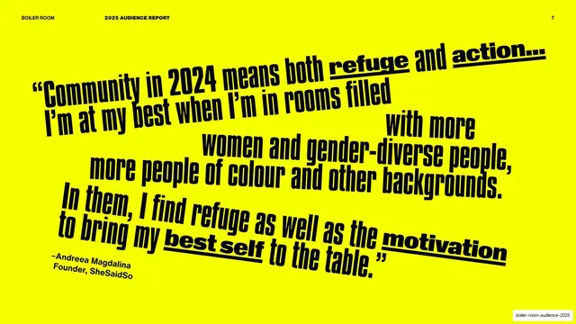
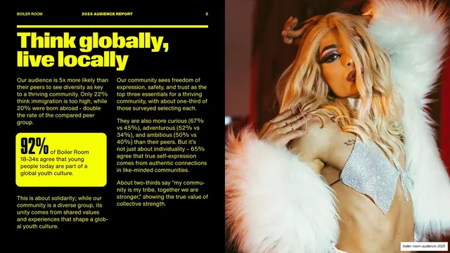
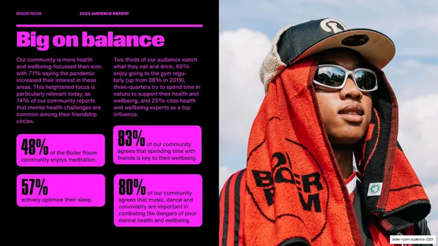
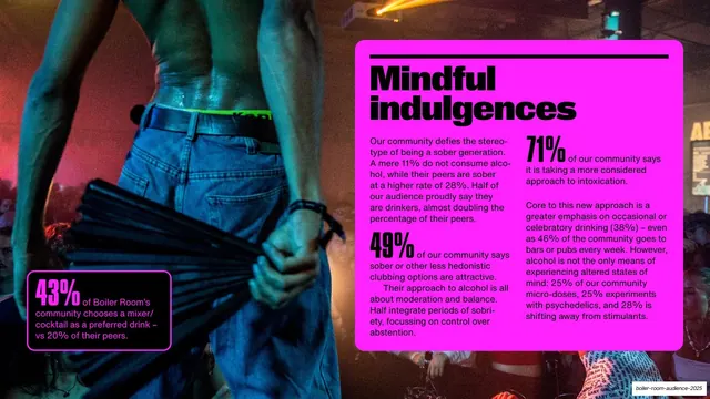
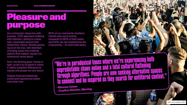
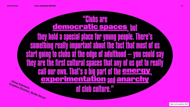
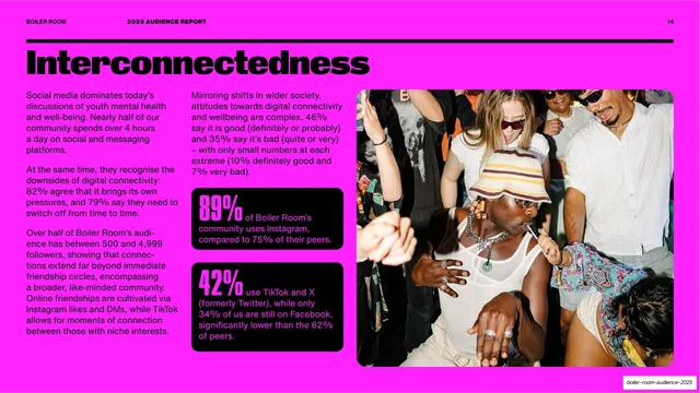
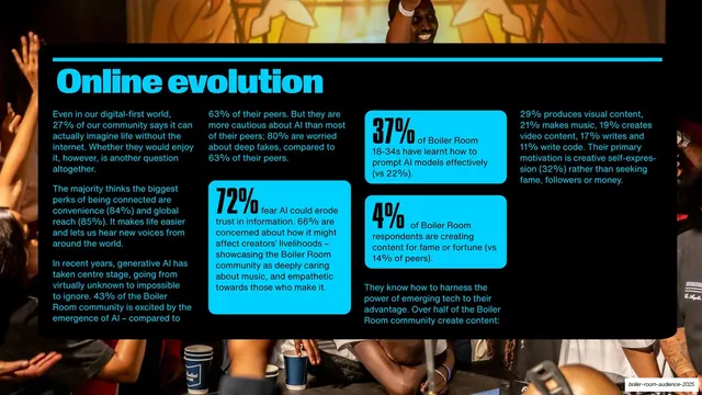
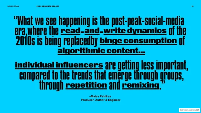
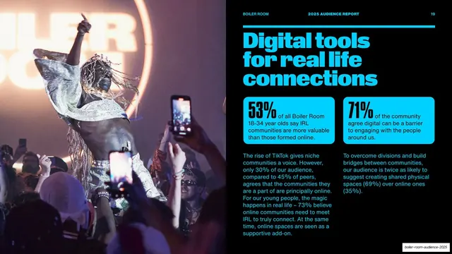
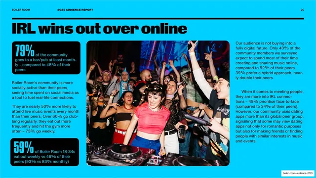
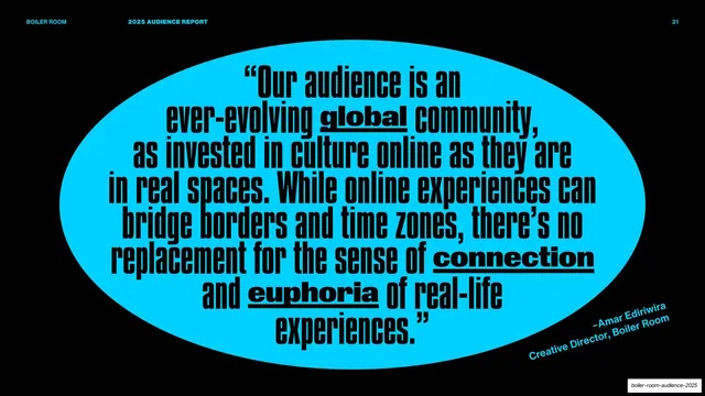
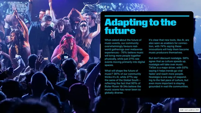
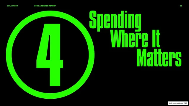
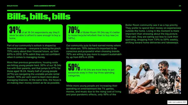
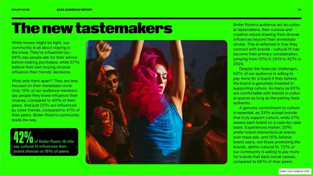
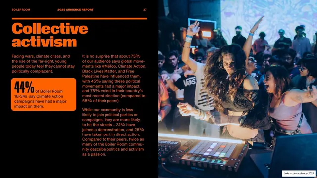
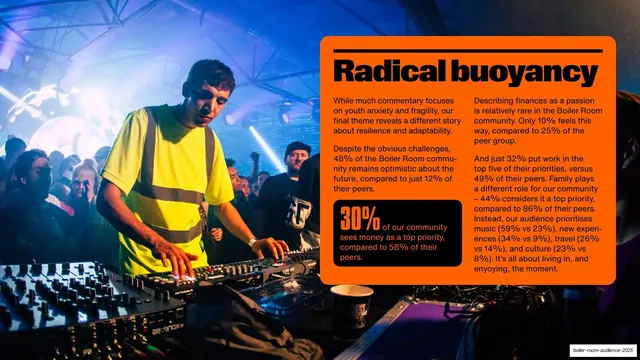
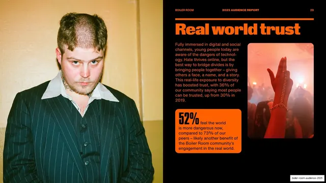
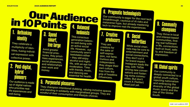
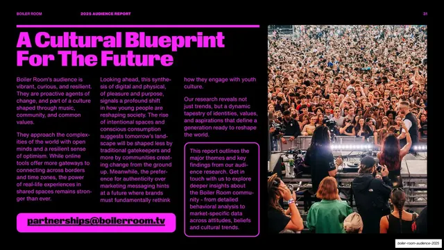
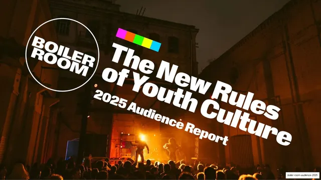
Slides run 16:9 on a near-black field. The color system rotates four neon accents that key the deck's five themes: lime green, hot magenta, cyan blue, and orange. Each theme opens with a divider slide showing a giant outlined number inside a thin ring on the left and an ultra-condensed accent headline on the right ("1 Rooted In The Collective"). The theme's content slides then invert to a full accent-color background carrying black type and black rounded-rectangle cards, while many photo-led slides stay black with the accent used only for the headline and stat callouts. Type is built from two families: headlines and the big numbers use a very tall, narrow grotesque (close to all-caps); body copy is a neutral sans set in two to four justified columns. A consistent running header sits on a thick accent rule across the top: "BOILER ROOM" left, "2025 AUDIENCE REPORT" center, the page number right. Recurring layouts include a full-bleed photographic cover with the circular Boiler Room logo and a rainbow color-bar mark; split text/photo content slides; full-bleed pull-quote slides where heavy rounded display type is set at jaunty rotated angles with underlined keywords; oval/ellipse quote slides (black oval on accent, or accent oval on black); percentage stat cards with oversized numbers; rounded-rectangle text-block panels laid over crowd photos; and a closing grid of ten small numbered cards. Photography throughout is high-energy, grainy, color-saturated club and crowd imagery.
Key takeaway
The rotating accent-per-section system: one fixed dark template that recolors itself lime, magenta, cyan, then orange so a long report stays varied without redesigning a single layout. The full-bleed rotated pull-quotes with underlined keywords, which turn a plain testimonial into a graphic event. And the inversion trick of flipping between black-on-accent and accent-on-black to separate divider, data, and quote moments.
Reuse notes
A strong reference for culture, music, media, or trend research reports and any data-dense deck that wants energy rather than corporate restraint. The numbered theme-divider, percentage stat card, and oval-quote patterns are directly reusable. Leans hard on a large library of genuinely good nightlife photography and an ultra-condensed display face; on weak imagery or a generic typeface the loudness collapses. The neon-on-black contrast is built for screen, not print.