
Preview image. Unlock full-res
A 20-slide dark-mode investor pitch for creator marketplace Panel, built on heavy uppercase grotesque headlines with one italic-serif accent word, giant section numbers, and 3D iridescent chrome renders.
Summary
A 20-slide investor pitch for Panel, a two-sided marketplace pairing 50M-plus content creators with performance-based advertiser campaigns. Its personality is a confident, mostly black deck where heavy uppercase grotesque headlines carry every slide, one word per headline is swapped into an italic serif for emphasis, and oversized lightweight section numbers anchor the bottom corners.
Visual description
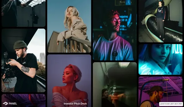
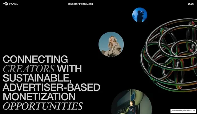
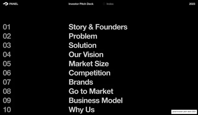
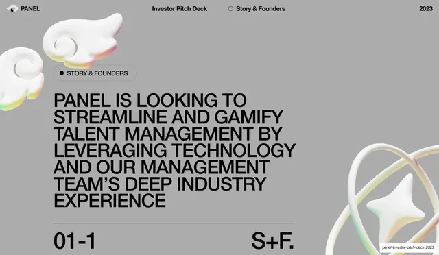
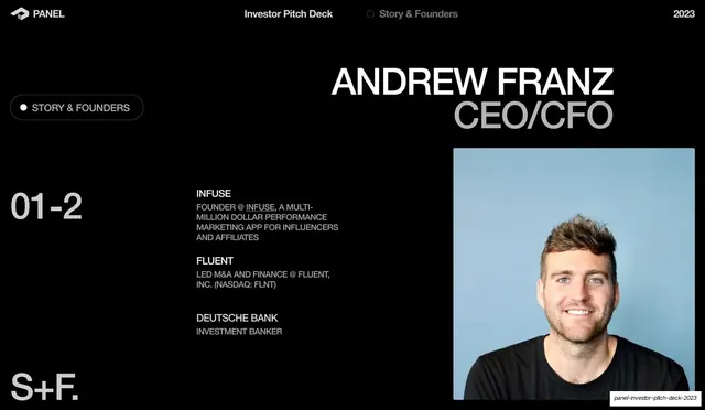
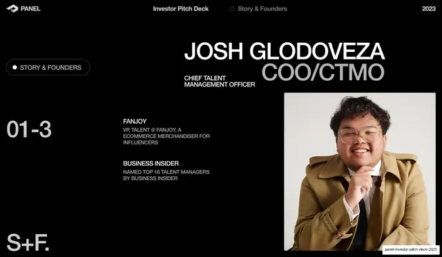
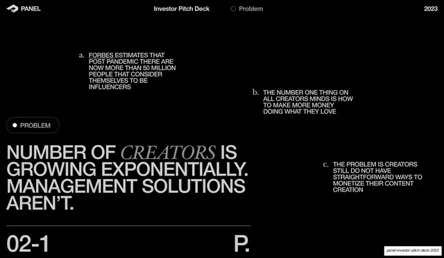
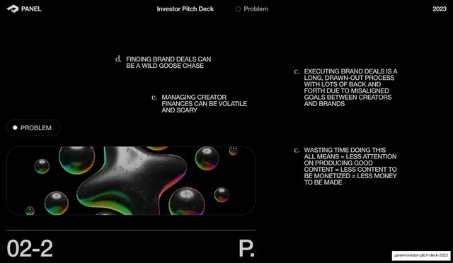
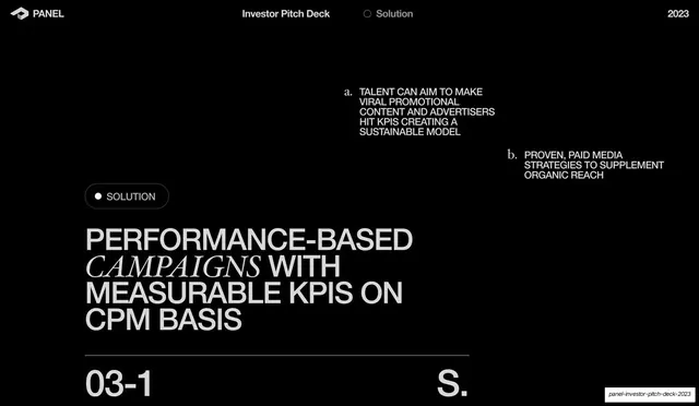
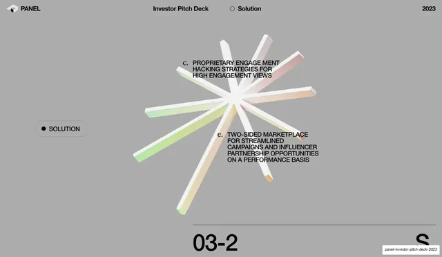
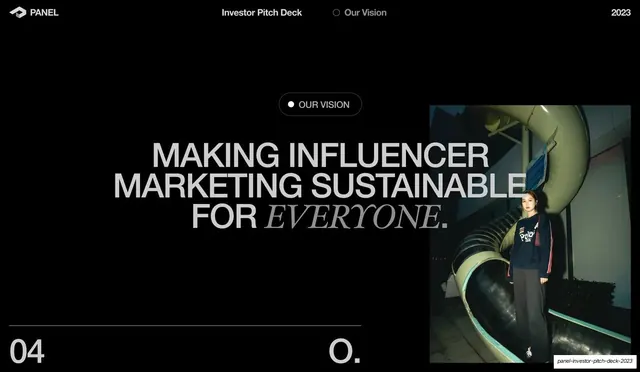
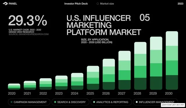
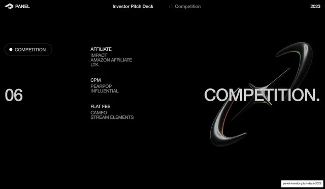
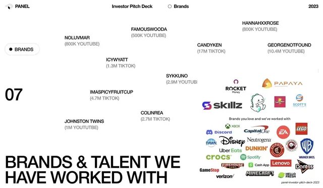
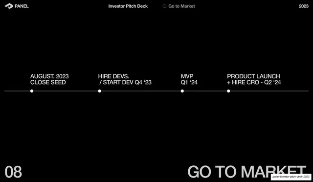
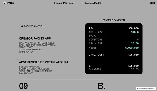
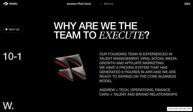
Slides run 16:9 and live in two background modes: a default near-black field with light-gray (#C9C9C9) type, and an occasional flat mid-gray field (story intro, business model) that flips the type to black. A consistent running header sits across the top of every interior slide: the Panel cube logo plus "PANEL" wordmark at left, "Investor Pitch Deck" center-left, a section label preceded by a hollow ring or filled dot in the center, and "2023" at right. Headlines are a heavy grotesque sans set large in all-caps, with a single key word ("CREATORS", "CAMPAIGNS", "EVERYONE", "EXECUTE") replaced by an italic serif as an accent. Supporting copy is broken into short lettered sub-points (a. b. c. d. e.) placed asymmetrically across the canvas rather than in a single column, with serif italic letter markers. Each interior slide closes with a hairline rule above a footer pairing: an oversized thin section number bottom-left (01-1, 02-2, 03-1, 08) and a giant gray section abbreviation bottom-right (S+F., P., S., O., B., W.). Recurring devices: rounded pill labels with a leading dot for the section name; glossy 3D renders in chrome and iridescent oil-slick finishes (a coiled ring knot, soap-bubble blobs, a starburst of bars, the Panel arrow mark); circular photo cut-outs of creators on the early slides; a green stacked-bar market-size chart; a black terminal-style monospace finance card; founder bio slides with a portrait at right and credential blocks at left; a horizontal milestone timeline; and a brand/talent logo wall mixing creator handles with recognizable consumer logos.
Key takeaway
The single italic-serif accent word dropped into an otherwise blunt all-caps grotesque headline, which adds editorial voice without changing the type system. The oversized section-number plus abbreviation footer that makes a long deck feel navigable and gives every slide a consistent anchor. And the willingness to scatter lettered sub-points asymmetrically across negative space instead of stacking them, which keeps dense dark slides from feeling like text dumps.
Reuse notes
A strong reference for creator-economy, marketing, media, and marketplace pitch decks, and for any investor deck that wants to read premium and editorial while staying mostly monochrome. The header, pill label, lettered sub-points, and section-number footer form a reusable interior-slide template. The iridescent and chrome 3D renders are the main spend; they carry the visual interest on otherwise plain black slides and need genuinely good assets to work. Headlines depend on a confident grotesque paired with a contrasting italic serif; weak on a single generic typeface.
From this deck: Panel Investor Pitch Deck 2023
View deck
More like this







Keep what you find
A free account saves references to boards and can send you a weekly email of picks based on what you save.
To see every result, go Pro.