
Preview image. Unlock full-res
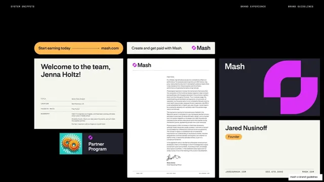
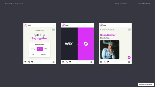
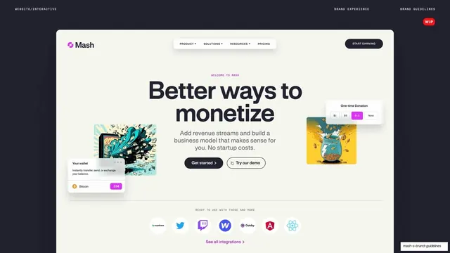
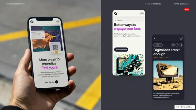
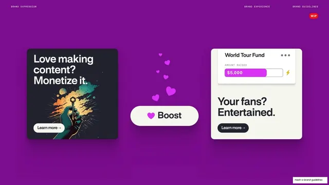
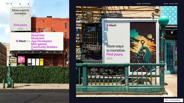
A 62-page brand guidelines deck for the Mash creator-monetization platform, built on alternating cream and near-black fields, a clean neo-grotesque sans, monospace utility labels, and a single bright magenta accent.
Summary
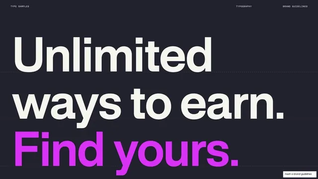
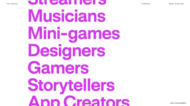
The internal brand guidelines for Mash, a creator-monetization platform. Its personality comes from a tight two-field system (warm cream and near-black navy-charcoal) paced against one loud magenta accent, oversized neo-grotesque headlines with the key phrase set in magenta, and a monospace utility layer that labels every page.
Visual description
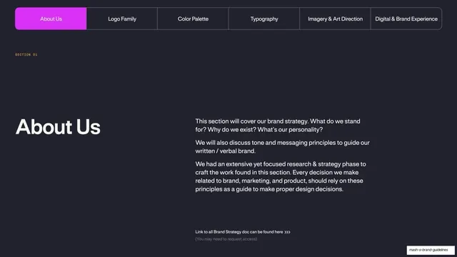
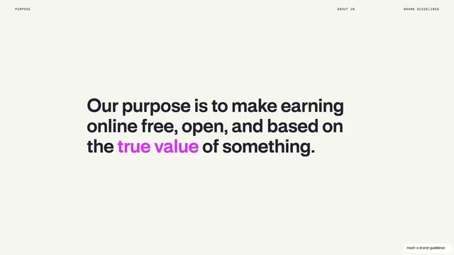
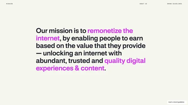
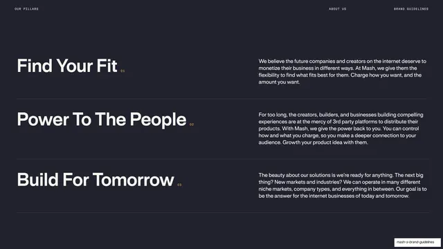
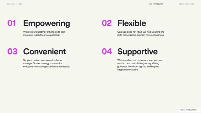
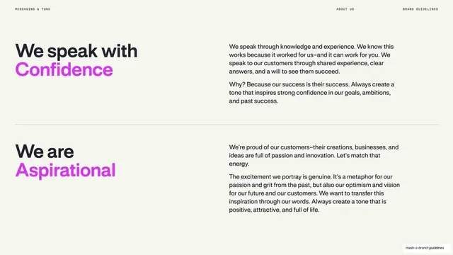
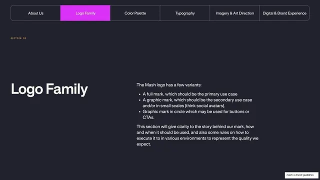
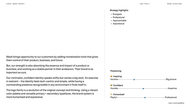
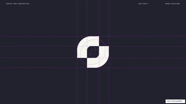
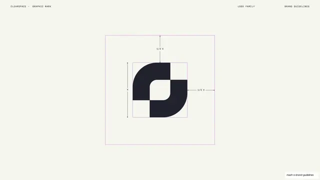
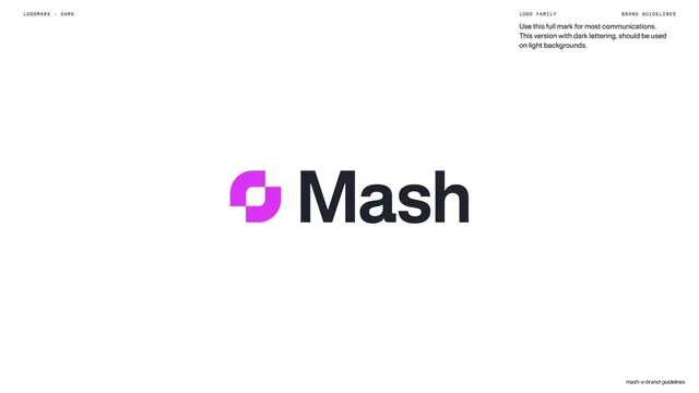
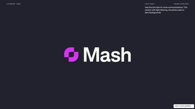
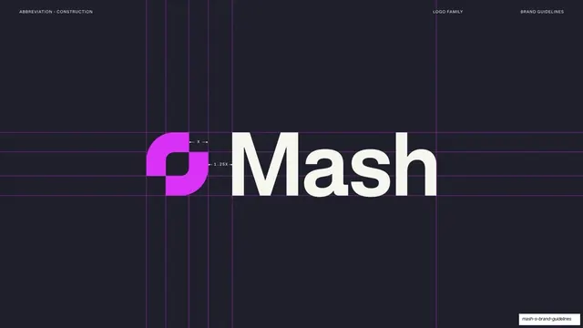
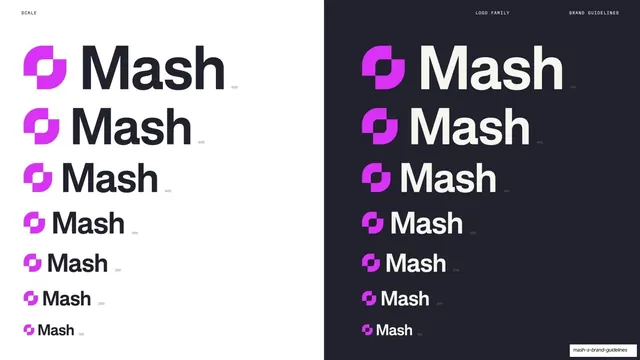
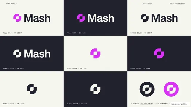
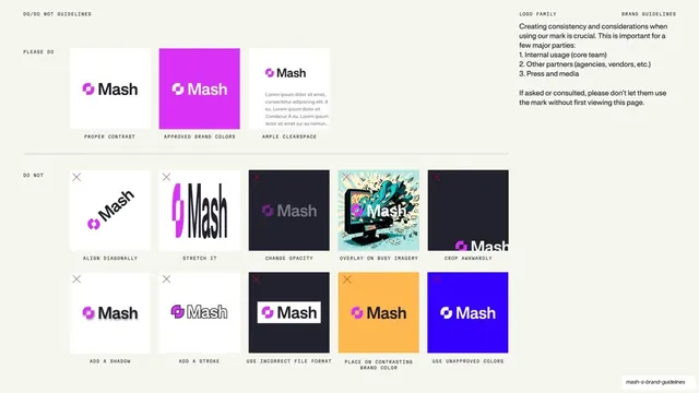
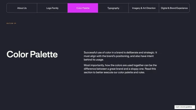
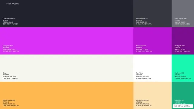
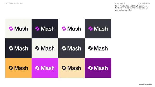
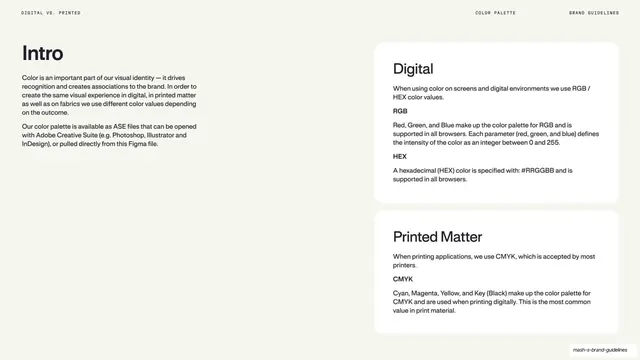
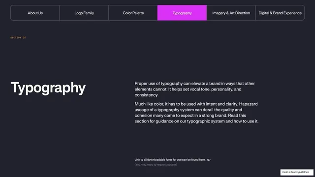
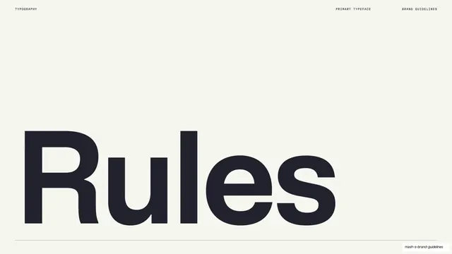
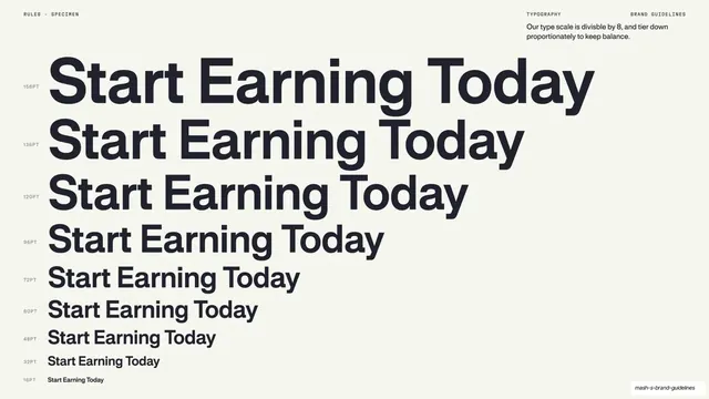
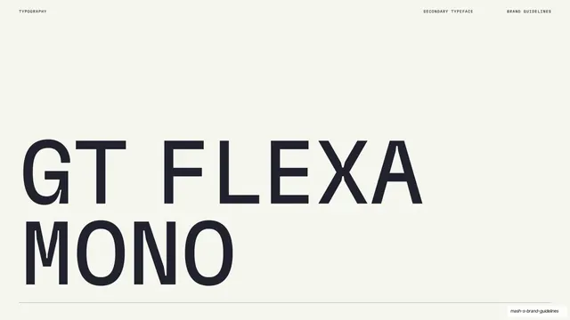
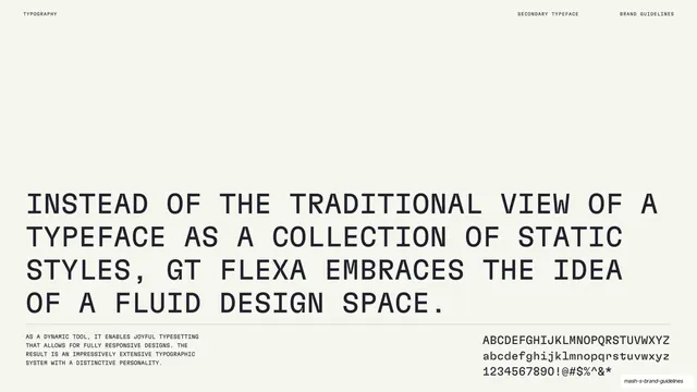
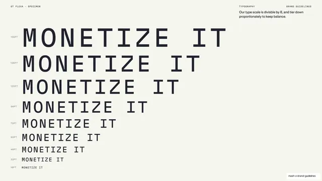
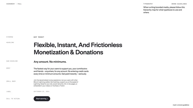
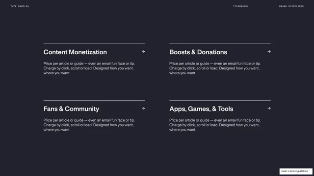
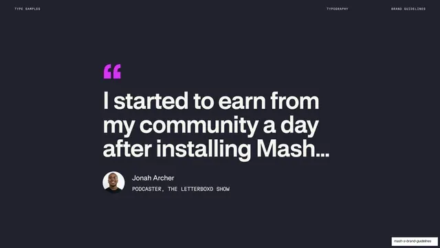
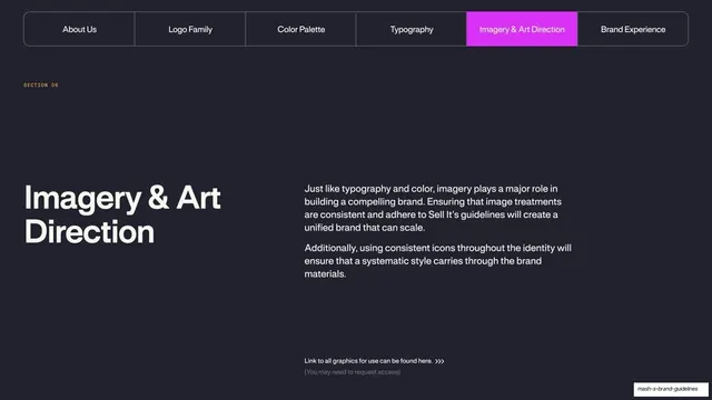
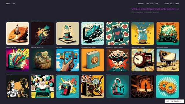
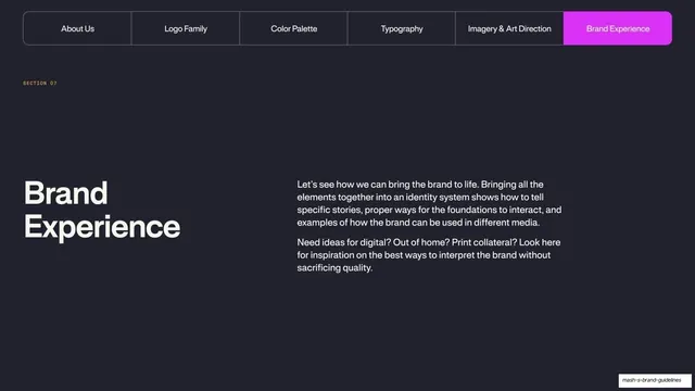
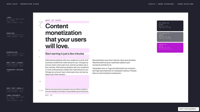
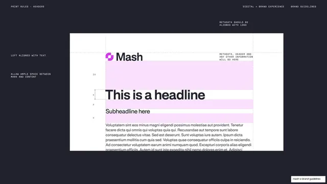
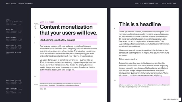
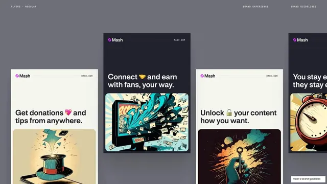
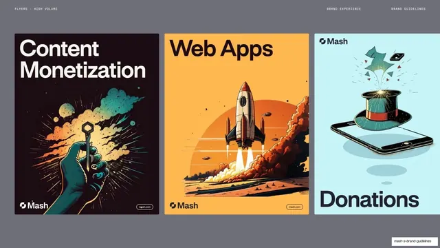
Pages run 16:9 across six sections (About Us, Logo Family, Color Palette, Typography, Imagery & Art Direction, Digital & Brand Experience). The base alternates between a warm off-white cream and a deep near-black navy-charcoal, with a single bright magenta (Mashgenta) accent that appears as highlighted words inside headlines, filled active tabs, and the logomark's left counter. Two type voices run throughout: a clean neo-grotesque sans (the brand typeface, "Rules") for headlines and body, and a small all-caps monospace for the running header and section numbers. A persistent header sits at the top of nearly every page: a mono section label upper-left, and breadcrumb labels ("ABOUT US / BRAND GUIDELINES", "LOGO FAMILY / BRAND GUIDELINES") upper-right. Recurring layouts: a tab-bar divider (a pill-segmented nav with the current section filled magenta over an oversized section title) that opens each section; split slides with an oversized headline left and stacked body paragraphs right; statement pages with one huge centered headline and the operative phrase in magenta; numbered attribute grids (01-04 in magenta beside bold labels); and large mark-display pages showing the graphic mark or full "Mash" wordmark centered on a clean field, paired with mono usage notes. Logo-system pages add construction grids, clearspace diagrams with dotted magenta guides and X-height callouts, and light/dark reversal pairs.
Key takeaway
The discipline of a two-field cream/black system carried by one accent color, where magenta only ever lands on the single word, tab, or counter that matters. The monospace running header as a quiet system layer that frames every page without competing with the headline. And the highlighted-phrase headline pattern (sans headline, key idea in magenta) used consistently from mission statements to tone-of-voice pages.
Reuse notes
A strong reference for SaaS, fintech, payments, or consumer-app brand books, and for any guideline or pitch deck that needs to feel modern, technical, and energetic without color clutter. The tab-bar section divider, numbered attribute grid, and split headline/body pages are directly reusable templates. The mono-label-plus-sans-headline pairing reads as a contemporary tech-brand house style; swap the magenta for any single saturated accent. Logo-construction and clearspace pages need vector precision to carry their detail.
From this deck: Mash Brand Guidelines 2023
View deck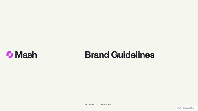










More like this










Keep what you find
A free account saves references to boards and can send you a weekly email of picks based on what you save.
To see every result, go Pro.