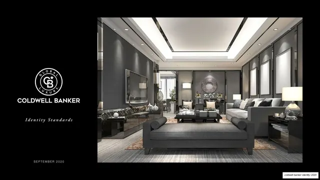
Preview image. Unlock full-res
A 67-page luxury real estate identity standards deck that runs an austere black-white-gray system, pairs Adobe Garamond headlines with a bold geometric sans, and lets dramatic property photography supply all the color.
Summary
The September 2020 identity standards for Coldwell Banker Global Luxury: a brand guideline deck whose entire personality is restraint. It alternates deep-black and bright-white spreads, sets section titles in a refined Adobe Garamond, and keeps a strict black-and-white logo and color system so that the only saturated color in the book comes from the real estate photography.
Visual description
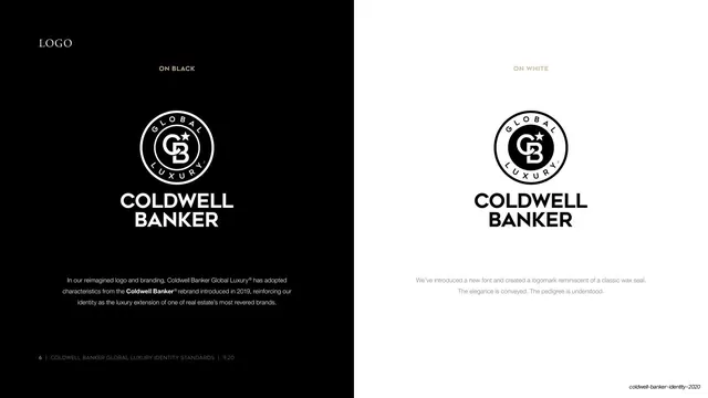
Pages run 16:9 in a monochrome system: pure black (#000000), white (#FFFFFF), and a tight gray ramp (Pewter #808284, Fog #D1D3D4), with two restrained secondaries used sparingly, Aegean blue (#14477C) and Camel Hair tan (#CFB799). The type pairing is consistent throughout: section headers in small-caps Adobe Garamond Pro, often with an italic Garamond qualifier after an en dash ("LOGO - variations", "VOICE - quiet confidence"), set against body copy in a clean grayscale sans and bold all-caps labels in the geometric "Coldwell Banker" display sans. The recurring grammar is a left column of small running copy paired with large logo, photography, or specimen blocks on the right, anchored to a hairline footer that reads "[page number] | COLDWELL BANKER GLOBAL LUXURY IDENTITY STANDARDS | 9.20". The hero asset is the reimagined circular logomark, a wax-seal roundel with an interlocked CB monogram and star, banded "GLOBAL" over "LUXURY", shown on black and white. Photography is treated as the color engine: cinematic interiors, infinity-pool exteriors, watches, and estates carry every saturated hue while the chrome around them stays neutral. Logo-rules pages use a DO NOT grid of crossed-out misuses; the color pages lay swatches as large circles with full CMYK / RGB / HEX specs; application pages mock the system onto stationery, swag, ads, and social profiles.
Key takeaway
The discipline of an all-monochrome brand system that deliberately offloads color onto photography, so the identity never competes with the product. The Garamond-small-caps plus geometric-sans pairing is a reusable luxury formula: a serif for poise, a bold sans for the mark. And the consistent left-rail running copy against big right-side specimen blocks is a clean, legible template for a long guideline that never gets visually tired.
Reuse notes
A strong reference for luxury, real estate, hospitality, or any premium brand guideline that wants to read as understated and expensive. The black/white/gray-plus-two-accents palette and the photography-as-color principle transfer directly. The wax-seal logomark and Garamond headers are bespoke to Coldwell Banker; borrow the structure, not the marks. Best when you have genuinely high-end photography to carry the spreads, since the system intentionally provides almost no color of its own.