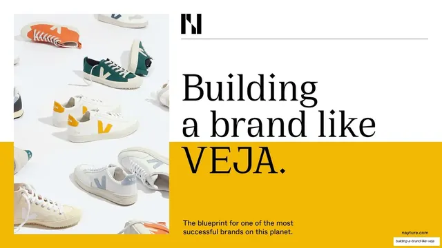
Preview image. Unlock full-res
An editorial sustainability report deck that analyzes VEJA against a Green Brand Code framework, using oversized serif headlines, guillemets, hairline-ruled grids, and per-chapter accent colors over documentary photography.
Summary
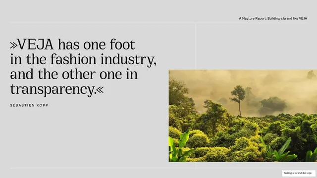
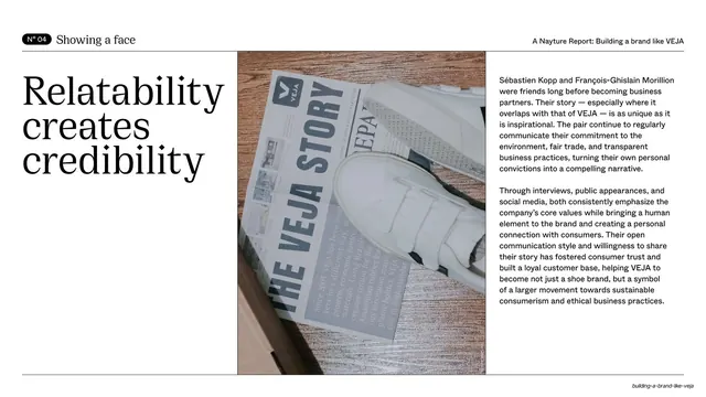
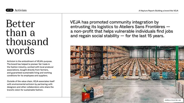
A report deck by agency Nayture GmbH that analyzes the sneaker brand VEJA against its proprietary eight-part "Green Brand Code". Its identity comes from oversized serif display headlines, heavy use of guillemets (»...«), hairline-ruled grids, and a per-chapter accent color, all laid over documentary product and nature photography.
Visual description
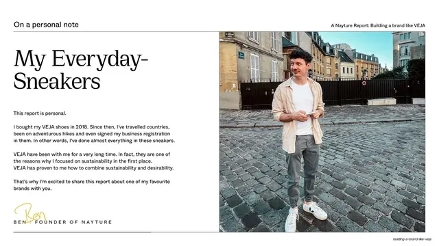
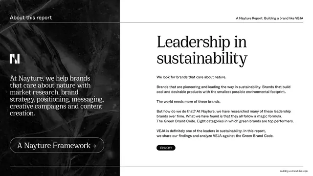
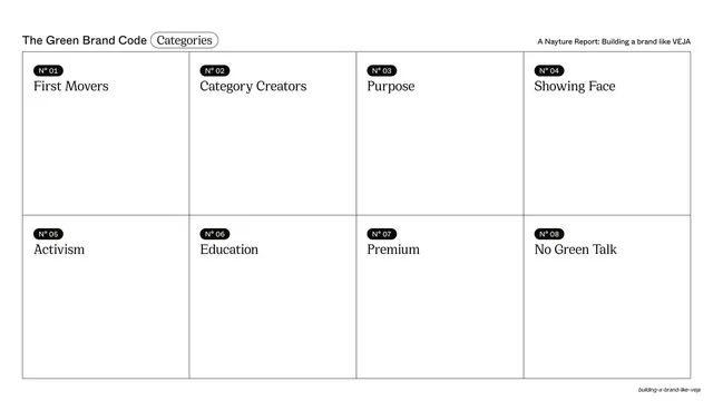
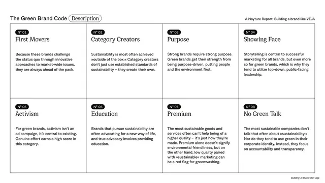
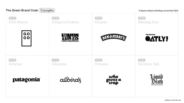
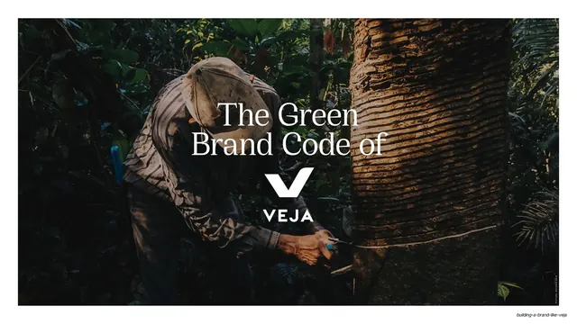
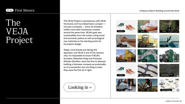
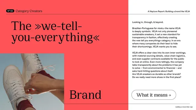
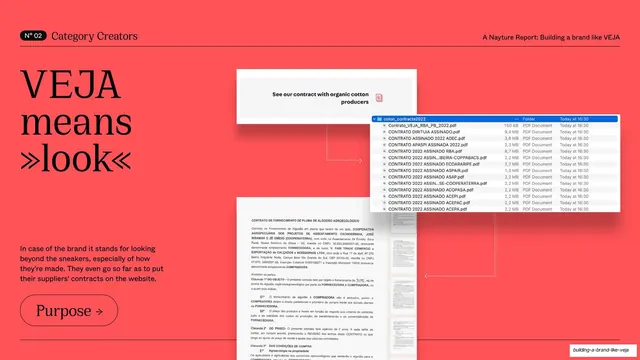
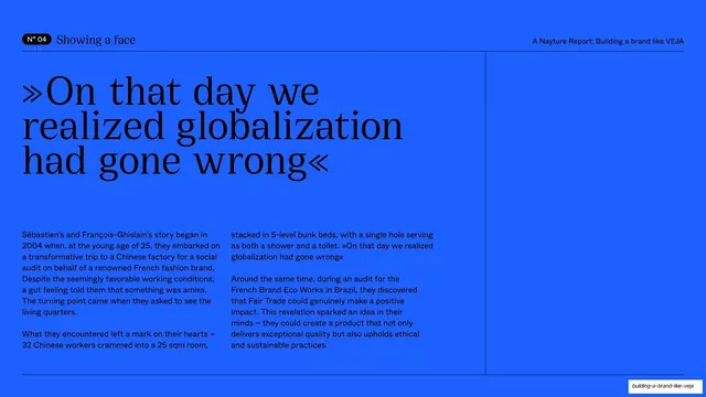
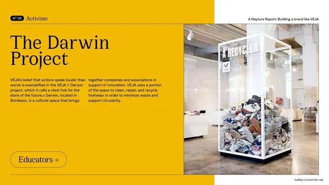
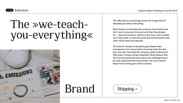
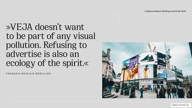
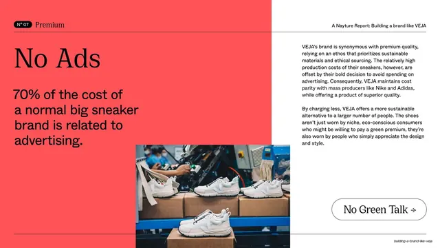
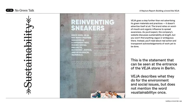
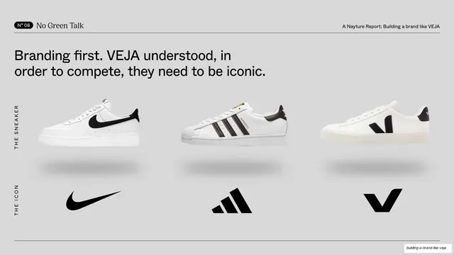
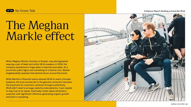
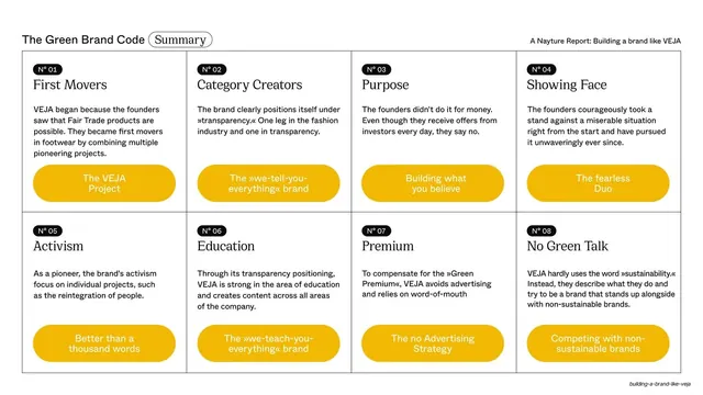
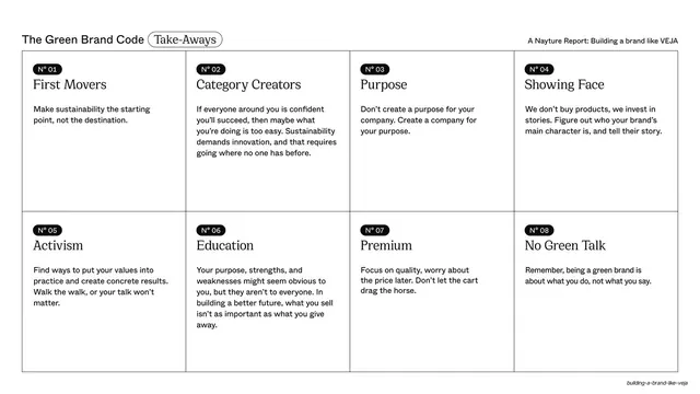
Slides are predominantly 16:9, with several near-cinematic widescreen photo interludes. The base palette is a warm off-white cream (#F5F4F1) and near-black (#0D0D0D), lifted by saturated per-chapter accents: a yellow cover band (#F2B705), coral-red Category Creators chapters (#FF5A4D), and muted khaki for Showing a Face (#9C8F6F). Type pairs an oversized serif display face for headlines and pull quotes with a small sans-serif for body copy and utility labels; the period in the title is rendered as a small diamond, and quotes consistently use guillemets. A persistent running header sits on a hairline rule (a section label or numbered N° pill on the left, "A Nayture Report: Building a brand like VEJA" on the right) with a matching footer rule. Recurring layout grammar includes: a reusable eight-cell framework grid shown three ways (empty index, filled descriptions, then example logos); a black or accent-colored title panel paired with a body-copy column and a captioned thumbnail mosaic for each detailed category; full-bleed darkened photographs carrying centered or left-aligned white serif statements; a symmetrical dotted-leader fact sheet around a circular photo crop; and outlined pill buttons ("Looking in ->", "What it means ->", "Why Sneakers ->") that cue the next idea. A circular rotated-text brand stamp and the Nayture "N" monogram recur as identity marks.
Key takeaway
The three-state reuse of one framework grid (index, then descriptions, then proof logos) builds structure through repetition and is the deck's smartest system move. The per-chapter accent color over a fixed cream-and-black base lets long sections feel distinct while staying unified. And the disciplined pairing of one oversized serif headline with tiny all-caps utility labels, plus guillemets throughout, gives the whole report a consistent editorial voice.
Reuse notes
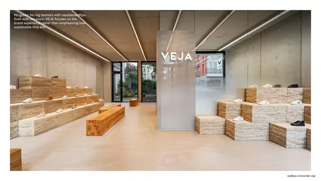
A strong reference for analytical or thought-leadership report decks, brand case studies, and any agency framework presentation that needs to stay editorial across many slides. The numbered-section chapter template (accent ground, stacked serif headline, short caption, pill button, supporting photo) and the dotted-leader fact sheet are directly reusable. The deck leans heavily on genuinely good documentary and product photography to carry its full-bleed and banner slides; it loses impact with weak stock imagery. The serif display face and guillemets are central to the look and should be matched, not substituted with a generic sans.
From this deck: Building a Brand Like VEJA report deck
View deck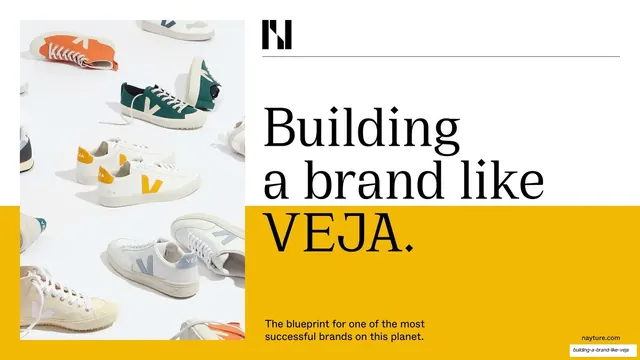









More like this










Keep what you find
A free account saves references to boards and can send you a weekly email of picks based on what you save.
To see every result, go Pro.