Preview image. Unlock full-res
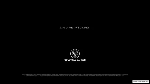
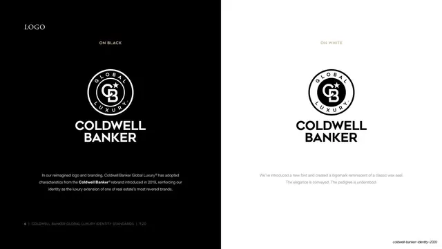
A split page showing the full Coldwell Banker logo reversed on a black half and positive on a white half, each with a caption and rationale.
Summary
The primary logo page: the full stacked lockup shown white-on-black on the left half and black-on-white on the right half, each labeled and annotated.
Visual description
The slide is split vertically into a black left half and a white right half. Each half centers the same stacked lockup: the wax-seal logomark (circular CB monogram with star, banded GLOBAL / LUXURY) above the bold all-caps "COLDWELL BANKER" wordmark. Above each, a small tracked all-caps label, "ON BLACK" (white) and "ON WHITE" (tan). Below each lockup runs a short centered gray sans rationale; the left also carries the Garamond small-caps "LOGO" title top-left. The mark is shown only in its two approved positive and reversed states.
Key takeaway
The hard black/white split presents both core logo states on one page so an approver sees the exact contrast behavior side by side. Centering identical lockups on opposing fields is the clearest possible way to specify reverse versus positive usage.
Reuse notes
A standard, copyable logo-page format for any brand book. The split-screen device works for any mark with a light and dark variant. Keep the surrounding space empty so the lockups read as specimens, not decoration.
From this deck: Logo on black and on white
View deck