Preview image. Unlock full-res
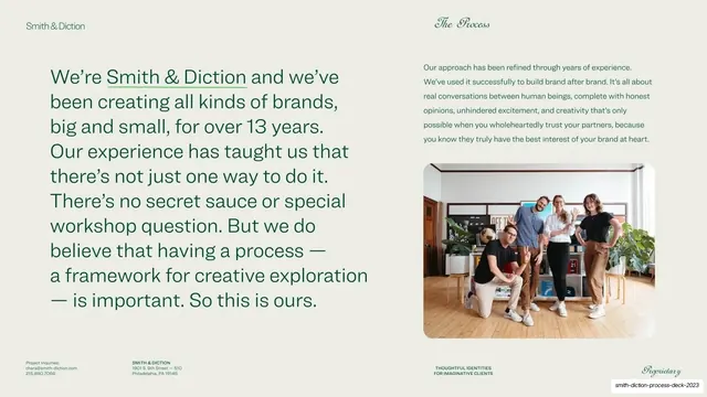
About slide with a large green sans lead paragraph on the left and a smaller supporting paragraph over a team photo on the right.
Summary
The studio story: a large green-sans lead paragraph about 13 years of brandmaking on the left, with a smaller supporting paragraph above a team photo on the right.
Visual description
Warm putty ground with the standard chrome ("Smith & Diction" left, "The Process" script right) and the four-cell footer. The left two-thirds holds a large green geometric-sans paragraph beginning "We're Smith & Diction and we've been creating all kinds of brands, big and small, for over 13 years..."; the studio name is underlined inline. The right column stacks a smaller green sans supporting paragraph about their refined, conversation-led approach above a rounded-corner photograph of the four-person team standing together in the studio. Type sizes create a clear two-tier hierarchy between the headline-scale story and the fine-print support copy.
Key takeaway
Telling the studio story as one oversized, plainspoken paragraph rather than bullet points, with the brand name underlined as the only emphasis. The smaller second paragraph plus a candid team photo adds warmth and proof without competing with the lead.
Reuse notes
A reusable "about us" or origin-story slide for studios and small agencies where voice matters more than stats. Works best with a genuine, unposed team photo. The two-tier paragraph hierarchy keeps a text-heavy slide readable; keep the lead copy short enough to stay oversized.