Preview image. Unlock full-res
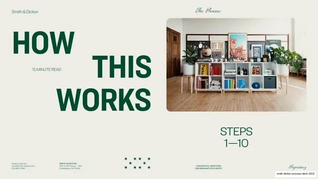
Intro to the process steps with oversized stacked green sans HOW THIS WORKS, a 15 minute read label, a styled studio shelf photo and a STEPS 1 to 10 marker.
Summary
The lead-in to the process: an oversized stacked "HOW THIS WORKS" green sans headline beside a warm studio shelf photo and a "STEPS 1-10" marker.
Visual description
Warm putty ground with the usual white-on-putty chrome ("Smith & Diction" left, "The Process" script right). An oversized all-caps green geometric sans headline stacks "HOW / THIS / WORKS" down the left and center, with a small "15 MINUTE READ" label tucked beside the first line. Top-right sits a rounded-corner lifestyle photograph of a styled studio cubby shelf filled with books, posters and plants. Below the photo, "STEPS / 1-10" is set in medium green sans. A small cluster of green stars/asterisks sits centered in the footer band above the four-cell tiny-caps footer.
Key takeaway
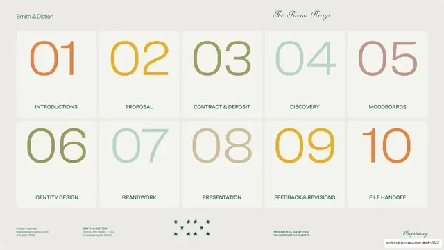
Setting a section intro headline so large it interlocks with the image block, while a tiny "15 minute read" honestly sets expectations for the chapter ahead. The "STEPS 1-10" marker primes the numbered grid that follows.
Reuse notes
A good template for introducing any multi-step or long-read section, with a reading-time cue that builds trust. Needs a warm, on-brand lifestyle photo to balance the heavy type. The interlocking oversized headline wants a tall, confident sans.