Preview image. Unlock full-res
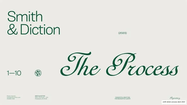
Section title slide pairing a large green geometric-sans Smith and Diction wordmark with an oversized green script The Process and a circular monogram.
Summary
The opening title slide: a large green "Smith & Diction" sans wordmark top-left and a sweeping oversized green script "The Process" filling the center-right.
Visual description
Warm putty full bleed with no top chrome. Top-left, the studio name "Smith & Diction" is set large over two lines in the upright green geometric sans, with a small "(2023)" in sans to its right. The lower-center is dominated by an oversized green engraver-style script reading "The Process", its swashes spanning most of the slide width. Bottom-left sits a small "1-10" page range in sans and a circular S&D monogram badge. The four-cell tiny-caps footer (inquiries, address, tagline, script "Proprietary") runs along the bottom edge.
Key takeaway
The deliberate clash of two type voices on one title slide: a blunt modern sans wordmark against a romantic oversized script for the section name, which instantly signals a studio that is both contemporary and craft-led. The "1-10" range quietly promises a numbered journey.
Reuse notes
A reusable section or chapter divider for any deck built on a sans plus script system. The oversized script needs a high-quality face with real swashes to look intentional rather than decorative. Pair with the matching numbered process grid later in the deck.
From this deck: The Process title slide
View deck

More like this





Keep what you find
A free account saves references to boards and can send you a weekly email of picks based on what you save.
To see every result, go Pro.