Preview image. Unlock full-res
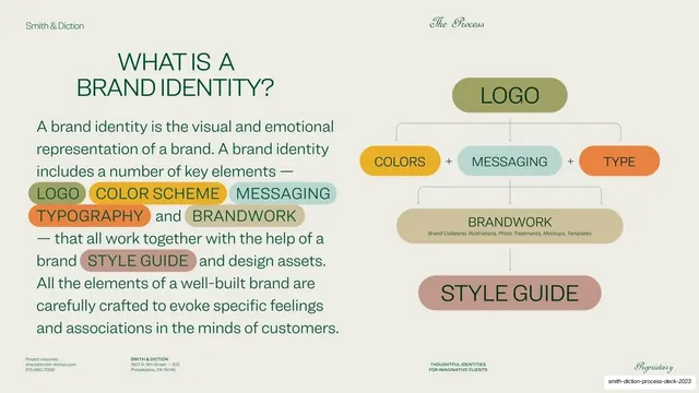
Split slide defining brand identity, with a green sans paragraph using pastel highlight pills on the left and a matching pill flow diagram on the right.
Summary
A two-column explainer defining a brand identity: a green paragraph with pastel highlight pills on the left, and the same pills arranged as a top-down flow diagram on the right.
Visual description
Warm putty ground. The standard chrome runs across the top ("Smith & Diction" sans left, "The Process" script right) and a four-cell tiny-caps footer below. Left column: an all-caps green sans headline "WHAT IS A BRAND IDENTITY?" over a justified green body paragraph; the key components (LOGO, COLOR SCHEME, MESSAGING, TYPOGRAPHY, BRANDWORK, STYLE GUIDE) sit inside rounded pastel highlight pills inline with the running text, each in a different muted color. Right column: a labeled flow diagram built from the same pills, a sage "LOGO" pill at top, connected down to a row of "COLORS" (ochre), "MESSAGING" (teal) and "TYPE" (orange) joined by plus signs, then down to a wide tan "BRANDWORK" pill with small sub-labels, and finally a rose "STYLE GUIDE" pill, all linked by thin hairline connectors.
Key takeaway
Using the exact same colored pill component for two jobs at once: inline emphasis in the paragraph and the nodes of the diagram beside it, so the words you highlight in the copy literally become the parts of the picture. It teaches the brand vocabulary twice without feeling repetitive.
Reuse notes
A clean pattern for any "what is X and what is it made of" explainer, onboarding, or anatomy slide. Works best when the same set of terms appears as both highlighted text and diagram labels. The muted multi-color pills keep a busy slide calm; on a darker ground they would need brighter fills.