Preview image. Unlock full-res
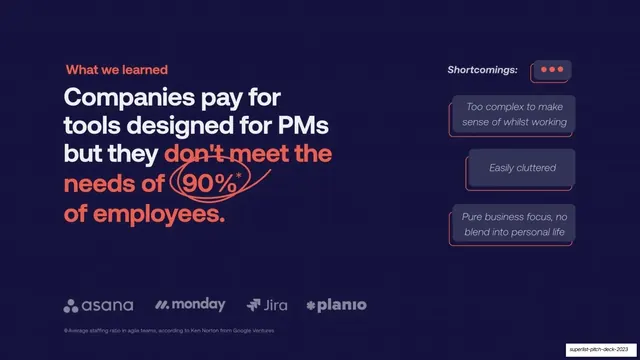
Dark competition slide where the headline circles a 90% stat in coral, with a chat-bubble list of incumbent shortcomings and a competitor logo strip.
Summary
A competition slide: the headline argues incumbent PM tools fail 90% of employees (with the stat circled by hand in coral), paired with a chat-bubble list of shortcomings and a strip of competitor logos.
Visual description
Deep navy field, coral "What we learned" eyebrow. Flush-left headline: "Companies pay for tools designed for PMs but they" in white, then "don't meet the needs of 90%* of employees." in coral, with a hand-drawn coral ellipse scribbled around "90%*". A small gray footnote credits the staffing-ratio stat to Ken Norton at Google Ventures. The right column stacks three coral-outlined chat bubbles with italic complaints: "Too complex to make sense of whilst working", "Easily cluttered", "Pure business focus, no blend into personal life", under a small "Shortcomings:" label and a bubble icon. Across the bottom a muted gray competitor logo strip lists asana, monday, Jira, and planio.
Key takeaway
The hand-drawn coral circle around the key stat, making one number the emotional center of the slide. Framing competitor weaknesses as italic chat-bubble quotes makes them feel like real user voices rather than a feature-gap table.
Reuse notes
A persuasive competition/gap slide for a pitch. The circled-stat gesture works once per deck. Keep competitor logos desaturated so they read as context, not endorsement. The chat-bubble complaints should sound like genuine user language.
From this deck: Competitor shortcomings
View deck





More like this






Keep what you find
A free account saves references to boards and can send you a weekly email of picks based on what you save.
To see every result, go Pro.