Preview image. Unlock full-res
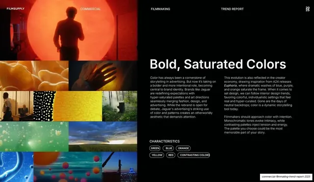
Trend slide with a large left-side grid of vividly colored film stills and an oversized "Bold, Saturated Colors" headline, two-column body, and keyword pills on the right.
Summary
The saturated-color trend, fittingly the most colorful page: a left grid of vividly graded film stills against an oversized "Bold, Saturated Colors" headline, two text columns, and a pill row on the right.
Visual description
Near-black slide with the standard running header. The left half is a grid of film stills in intensely saturated hues: a figure silhouetted against a glowing orange disc, yellow petals, a black-and-yellow dotted pattern, blue liquid bubbles, green and orange abstractions, a city skyline at dusk. The right half leads with a large white headline, "Bold, Saturated Colors", over two narrow columns of body copy on color as a branding tool (citing Jaguar's rebrand and A24's Euphoria). Below sit the "CHARACTERISTICS" label and outlined pills: GREEN, BLUE, ORANGE, YELLOW, RED, CONTRASTING COLORS. A white "7" anchors the bottom-left.
Key takeaway
Matching the imagery to the message: the slide about saturated color is itself the most saturated grid in the deck, so the example proves the point. The strict black chrome around it makes the colors pop harder.
Reuse notes
The grid variant again, here used to let a riot of color sit safely inside the dark template. Works when the topic itself is visual; the surrounding black-and-white keeps the colorful grid from feeling chaotic. Keep the headline and pills on the calm side.