Preview image. Unlock full-res
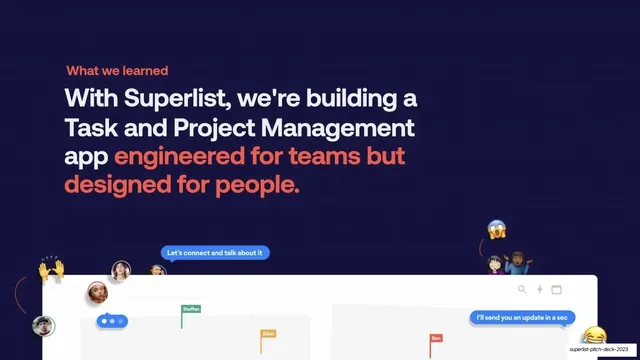
Dark solution slide with a two-tone headline restating the positioning over a tilted product-UI mockup ringed with emoji and chat-bubble pills.
Summary
The solution slide: a two-tone headline restating Superlist as engineered for teams but designed for people, sitting above a tilted product-UI mockup surrounded by emoji, avatars, and chat-bubble pills.
Visual description
Deep navy field, coral "What we learned" eyebrow. Flush-left headline runs four lines: "With Superlist, we're building a Task and Project Management app" in white, then "engineered for teams but designed for people." in coral. The bottom third holds two overlapping, slightly tilted light-gray product-UI panels bleeding off the bottom edge, showing list rows with colored name flags (Steffen, Sibel, Ben) and a top toolbar with search, lightning, and window icons. Floating around the panels are round user avatars, a clapping-hands emoji, a screaming-face emoji, a shrugging-people emoji, a laughing emoji, and two blue chat-bubble pills ("Let's connect and talk about it", "I'll send you an update in a sec"), conveying a lively, human, collaborative product.
Key takeaway
Surrounding a product screenshot with emoji, avatars, and chat pills to dramatize the "designed for people" promise, turning a flat UI shot into a scene of real collaboration. Tilting and bleeding the panels off-canvas adds energy and depth without a device frame.
Reuse notes
A good solution or product-intro slide when the differentiator is human and social. The emoji-and-pill treatment fits a friendly consumer-leaning brand; it would feel off for an austere enterprise tool. Needs a clean product UI underneath to carry the scene.