Preview image. Unlock full-res
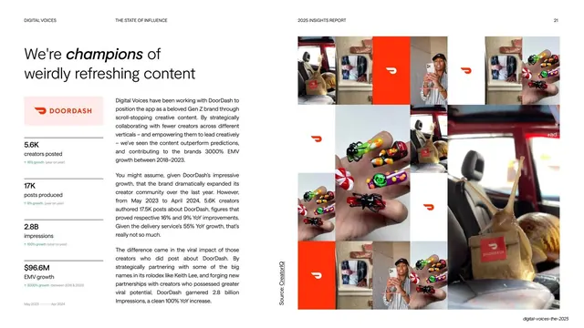
White case-study slide on DoorDash, pairing an italic headline and a stacked metrics column at left with a large red-accented creator photo grid at right.
Summary
A DoorDash case study: a mixed roman-and-italic headline and a vertical stack of four metrics on the left, set against a large grid of creator photos punctuated by the red DoorDash logo on the right.
Visual description
White slide. Top-left headline mixes roman and italic weights ("We're champions of weirdly refreshing content"). Below it a pale pink box holds the red DoorDash wordmark, then a vertical list of four metrics each with a small green year-on-year delta: 5.6K creators posted, 17K posts produced, 2.8B impressions, $96.6M EMV growth. Two columns of body copy fill the lower middle. The right half is a tight grid of creator phone-in-hand and nail-art photos interleaved with solid red-orange tiles bearing the white DoorDash glyph; an "#ad" label appears in one tile. A vertical "Source: CreatorIQ" credit runs up the gutter.
Key takeaway
Theming the whole case study in the client's brand red, including red filler tiles woven into the photo grid, so the brand color does the styling work. The pink logo lockup plus a stacked metrics list reads as a compact campaign scorecard.
Reuse notes
A reusable case-study layout for portfolio, sales, or report decks: brand lockup and metrics column on one side, a brand-colored photo grid on the other. Needs enough on-brand UGC stills to fill the grid; swap the accent color per client.
From this deck: DoorDash case study with photo grid
View deck















More like this




Keep what you find
A free account saves references to boards and can send you a weekly email of picks based on what you save.
To see every result, go Pro.