Preview image. Unlock full-res
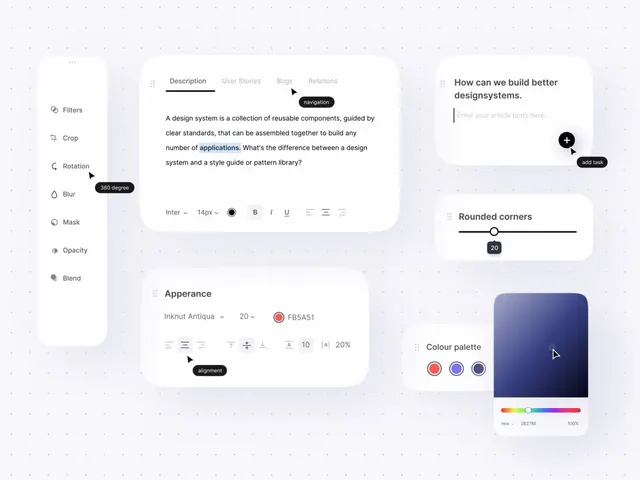
A design tool interface showing documentation panel with side-mounted filters and appearance controls, paired with a design-system explanation and rounded-corner settings.
Summary
A design tool interface with two split panels: a left sidebar housing filter controls, and a center-right documentation area with tabbed content (Description, User Stories, Bugs, Relations) plus appearance property controls including typography, rounding, and color-picker.
Visual description
Three-column layout on light lavender background: narrow left sidebar contains stacked filter icons (Filters, Crop, Rotation with tooltip "360 degree", Blur, Mask, Opacity, Blend) with minimal iconography; center column shows white rounded card with tab navigation (Description selected with underline, other tabs gray), explanatory paragraph text defining design systems, small black "navigation" and "add task" action badges with plus icon; right column displays centered white card with "How can we build better designsystems" headline, input placeholder "Enter your article body here...", right-side plus button with tooltip "add task"; below, "Rounded corners" control with slider and value field "20", and "Colour palette" section showing three round color swatches (red, blue, blue) with a horizontal color-spectrum slider below.
Key takeaway
The sidebar filter menu using simple icons with hover tooltips reduces clutter while keeping all tools accessible. Tabbed content areas with clear underlines establish focus. Properties controls (sliders, color pickers, input fields) are right-aligned for scannability, paired with clear labels. The mix of text-heavy documentation and property controllers on a single page works for complex tools.
Reuse notes
Ideal for design tool UIs, CMS interfaces, or documentation platforms where multiple controls need to coexist. The color red used sparingly as an alert/active state indicator (in the color palette row). Keep filter icons simple and consistent in weight.