Preview image. Unlock full-res
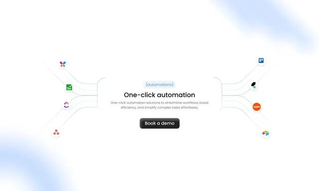
SaaS hero section promoting one-click automation using a radial hub-and-spoke line diagram with app icons radiating outward from a centered value proposition.
Summary
SaaS hero section promoting one-click automation using a radial hub-and-spoke line diagram with app icons radiating outward from a centered value proposition.
Visual description
Soft light blue gradient background (white top, pale blue bottom). At the center, large black sans-serif headline "One-click automation" sits above gray subheading text describing automation solutions. A blue-tinted code-bracket "{automations}" label floats above the headline. Radiating outward in all eight directions are thin gray lines connecting to eight app integration icons (spreadsheets, checkmarks, chart icons, colorful brand logos) positioned at the cardinal and diagonal edges. A dark charcoal "Book a demo" button sits below the headline. The overall composition is perfectly centered and symmetrical, using the diagram itself as the primary visual element to convey integration and connected workflow.
Key takeaway
The radial diagram efficiently communicates integration scope and platform connectivity without listing features or using dense copy. By placing real app logos (or logo placeholders) at the line endpoints, the layout instantly answers "what can this connect to?". The centered, symmetrical composition and gentle gradient background create calm and trustworthiness, essential for B2B automation tools. The thin line weight keeps the layout airy and modern, avoiding a cluttered, over-technical appearance.
Reuse notes
Best for SaaS products emphasizing integration or workflow automation, especially when you can showcase 6-8 real partner platforms or capabilities. The radial layout works well for above-the-fold hero sections that need to communicate connectivity without deep explanation. Avoid if the integrations are numerous (more than 8-10 becomes visually overwhelming) or if you need to highlight multiple product tiers or editions. Works well paired with a brief demo CTA below. Scale the icon sizes to match their relative importance to the user.