Preview image. Unlock full-res
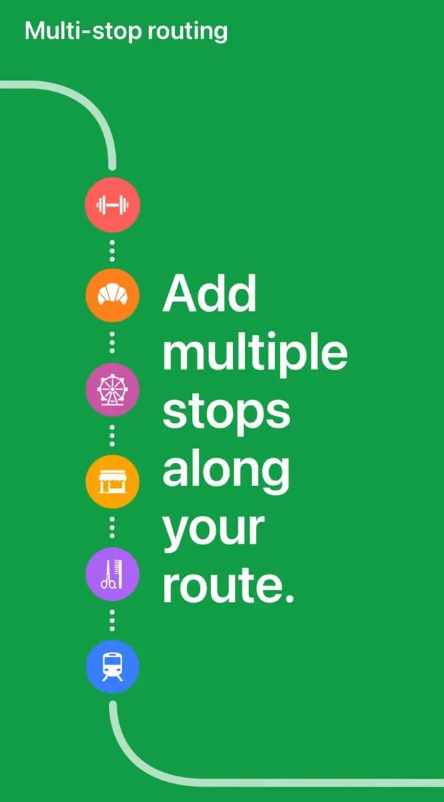
Mobile routing interface stacking colored circular icon badges connected by a curved white line, illustrating multi-stop navigation with descriptive text aligned right.
Summary
Logistics UI using a vertical timeline of colorful circular icon badges (each color-coded for a stop type: fitness, food, shopping, retail, transit) connected by a curved white line to illustrate sequential routing.
Visual description
Emerald green background with white text and icons. A curved white line anchors the left edge, connecting six stacked circular icons in complementary colors: red (fitness dumbbell), orange (food fan), magenta (shopping wheel), blue (retail storefront), purple (building), and cyan (transit train). Each icon sits at a distinct visual station. Adjacent to each icon, large white sans-serif text describes the action: "Add multiple stops along your route." The top headline "Multi-stop routing" anchors the composition. The design balances geometric simplicity (perfect circles, straight text) with organic rhythm (curved connecting line).
Key takeaway
The curved connecting line as a visual metaphor for continuity while each icon remains distinctly readable. The complementary color palette draws immediate attention to icon diversity without clutter. Large, bold typographic pairing with small icon badges creates clear information hierarchy. The timeline pattern is scalable to any number of stops.
Reuse notes
Ideal for logistics apps, ride-sharing multi-drop flows, tour-planning UIs, or delivery-route visualizations. The vibrant palette signals activity and friendliness, suitable for consumer-facing transportation apps. The vertical stacking works best at 4-8 stops; beyond 8, consider scrolling or grouping. This pattern is inherently accessible with high contrast, making it excellent for deliverables requiring WCAG 2.1 AA compliance.