Preview image. Unlock full-res
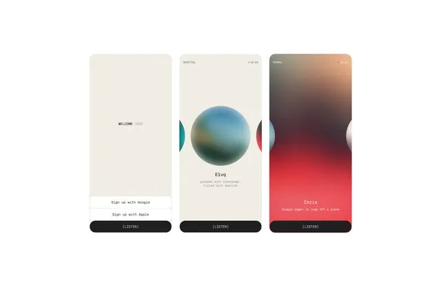
Three responsive mobile application interface screens featuring centered gradient orbs, authentication states, and minimal sans-serif typography on light backgrounds.
Summary
Three mobile app screens showcasing a minimal design system centered on a gradient orb as the primary visual element, with authentication and onboarding flows.
Visual description
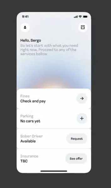
Three phone mockups are displayed side by side. Each screen features a light beige or white background with a centered gradient sphere (ranging from teal-blue to pale lavender in the leftmost screen). Below each orb sits serif or sans-serif text labels like WELCOME, ELVA, or CORIS, followed by descriptive sub-text. Dark button labels appear at the base of each screen. The overall palette is minimal with warm neutrals and a single cool gradient.
Key takeaway
Gradient orbs as focal point can replace traditional imagery on app screens and feel modern without being trendy. Centering the visual creates calm and focus. Minimal supporting text keeps the interface uncluttered.
Reuse notes
Strong for wellness, meditation, or lifestyle apps. The gradient orb approach is gender-neutral and accessible. Works well across different onboarding stages where a visual constant (the orb) provides continuity.