Preview image. Unlock full-res
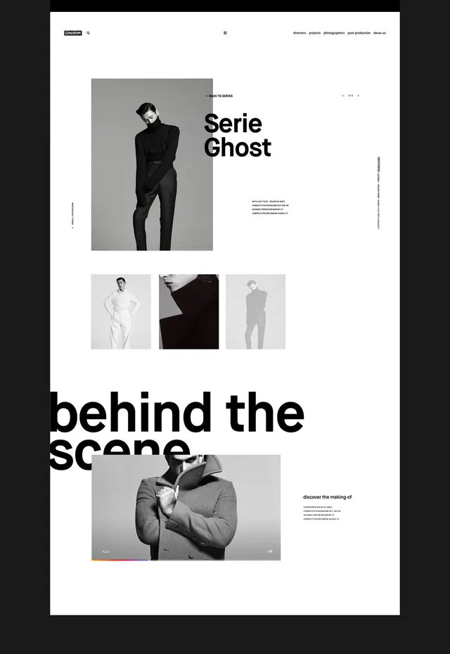
A minimalist editorial webpage featuring clean typography, split-screen imagery of a male model, and organized information hierarchy with Swiss grid principles.
Summary
A clean, Swiss-inspired website layout for "Onirim" featuring a bold large-format heading ("Serie Ghost" / "behind the scene"), split photography sections, and organized text blocks creating a sophisticated editorial grid.
Visual description
Cream background with black text and photography. The top section displays a large model portrait on the left with "Serie Ghost" headline and descriptive copy on the right. Below, a gallery row of three smaller lifestyle images sits above a larger full-width photograph with additional text block. Navigation and branding appear minimal at the top. The layout leverages generous whitespace and precise grid alignment.
Key takeaway
The power of Swiss grid principles applied to editorial web design: the disciplined spacing and alignment create sophistication without ornamentation. Bold typography and large imagery anchor the hierarchy.
Reuse notes
Ideal reference for editorial websites, luxury brands, fashion portfolios, or designer portfolios. Works especially well when photography is strong and the goal is elegant restraint rather than visual noise.