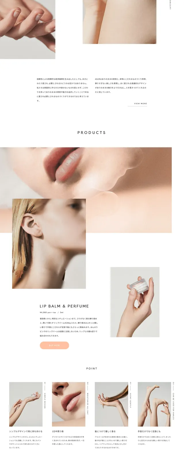
Preview image. Unlock full-res
A sophisticated beauty brand corporate page featuring a clean layout with a focus on heritage and product elegance.
Summary
A sophisticated beauty brand corporate page featuring a clean layout with a focus on heritage and product elegance.
Visual description
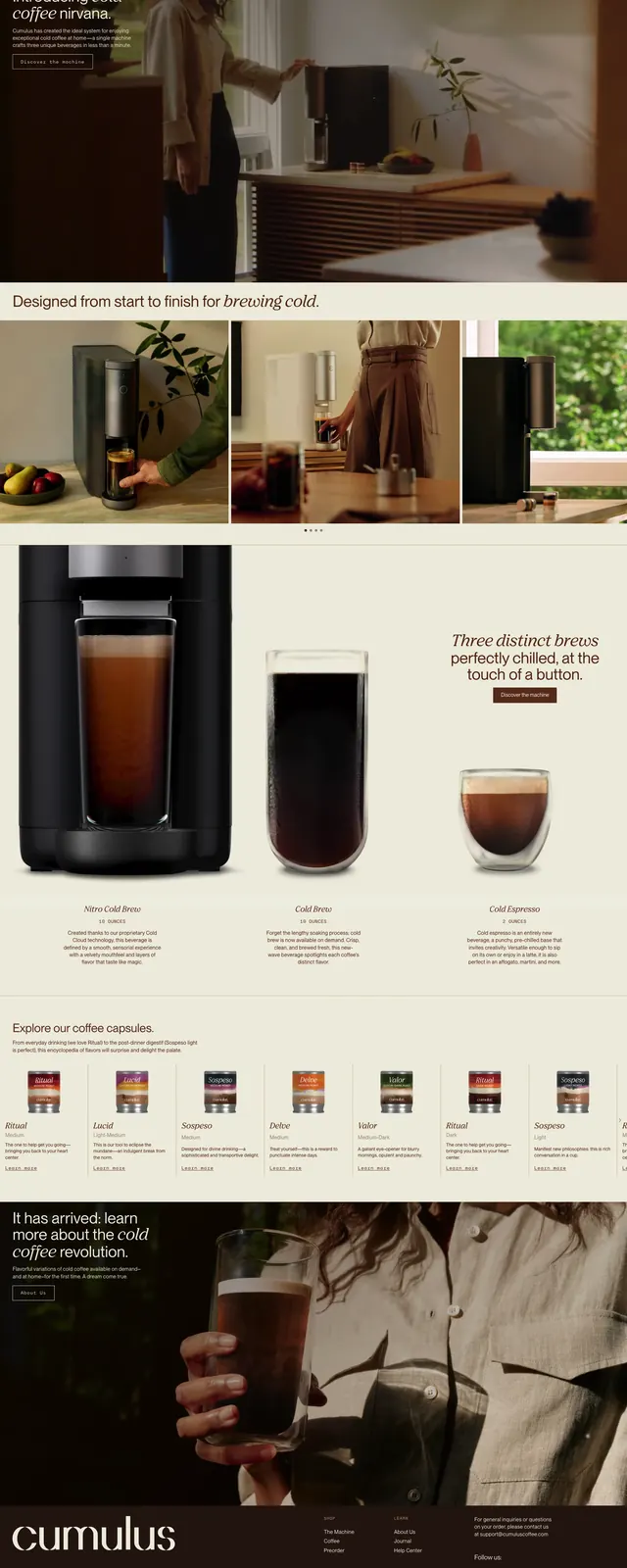
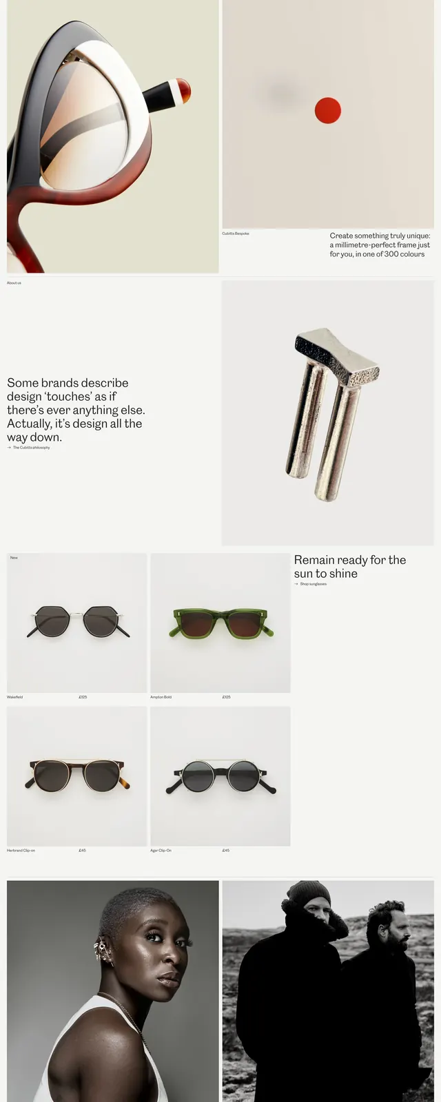
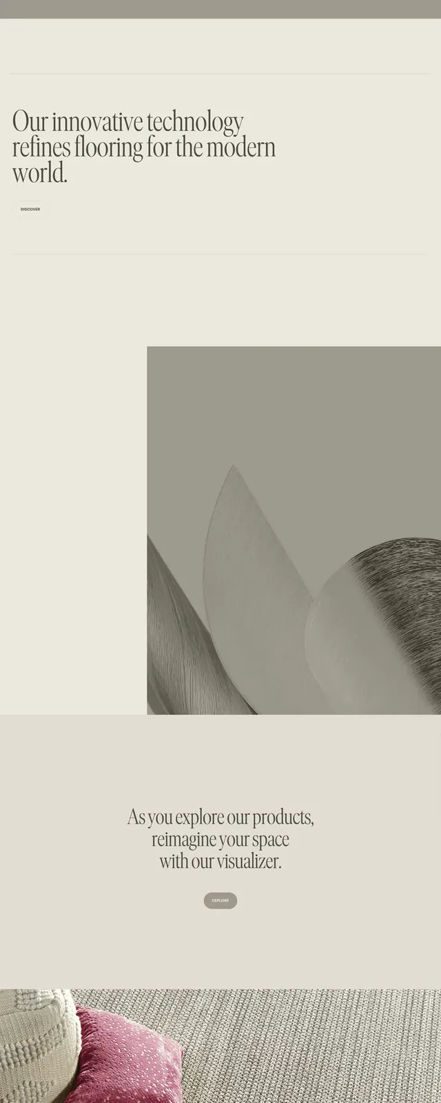
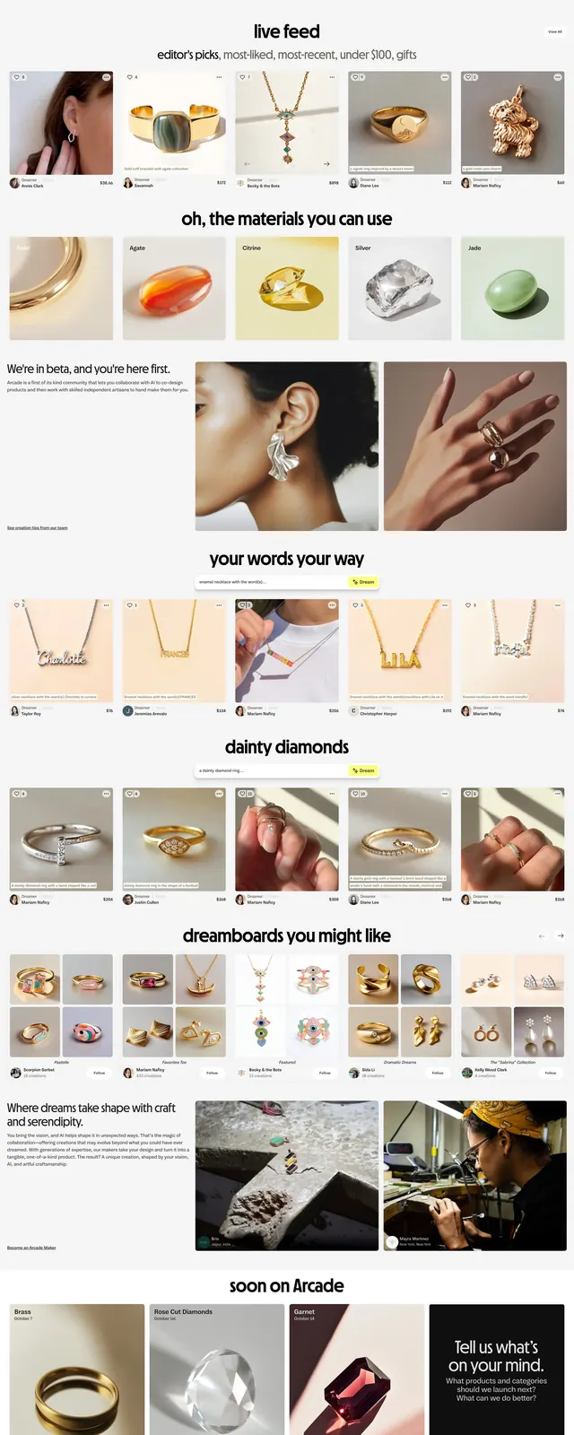
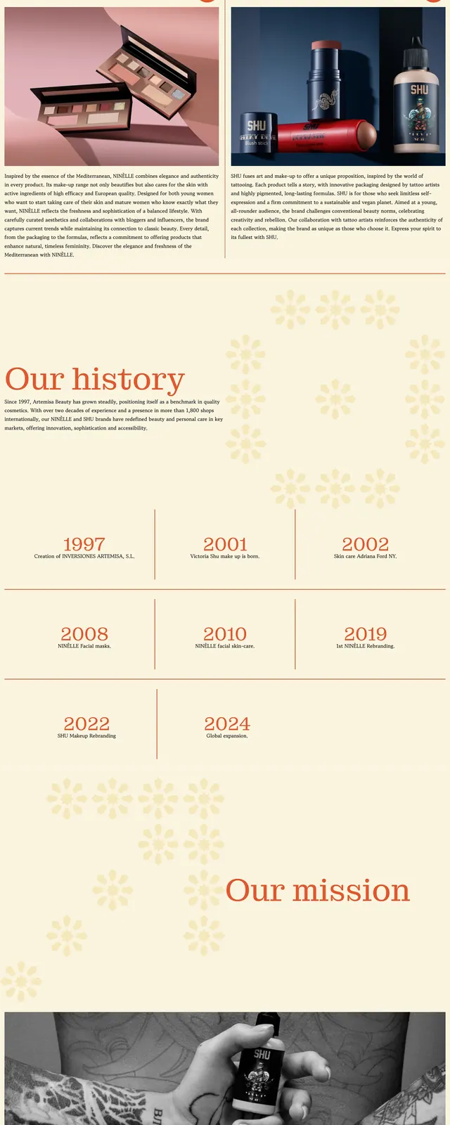
The page uses a cream and soft orange color palette with high-quality product photography. It features a centered serif logo at the top, followed by a split-screen image section and a structured grid-based company history timeline. The footer is a bold, solid orange block with centered typography.
Key takeaway
The use of ample white space and a refined serif typeface creates a high-end, trustworthy feel suitable for luxury cosmetics.
Reuse notes
The grid-based timeline is an effective way to present company milestones without cluttering the page.