Preview image. Unlock full-res
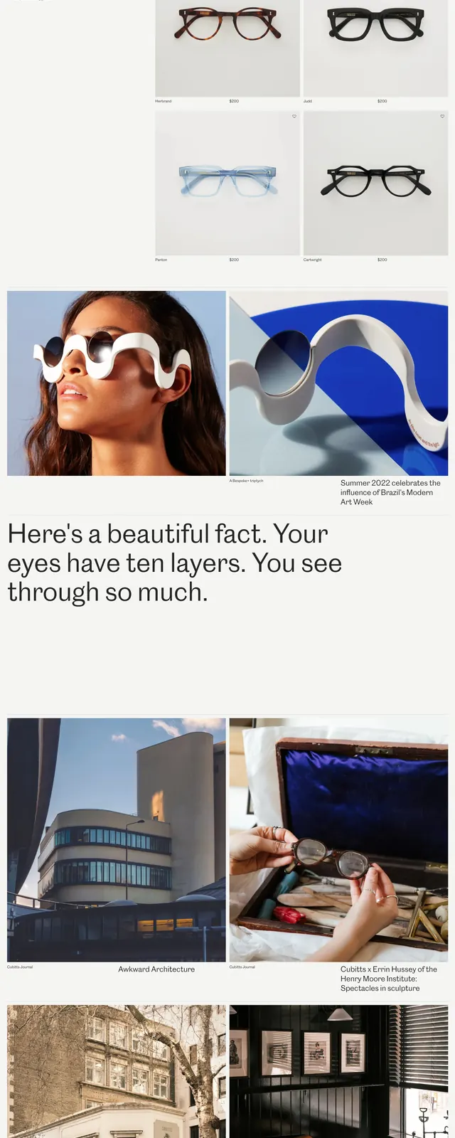
A minimal luxury eyewear homepage with large product photography, sparse editorial copy, and a calm grid of retail-focused sections.
Summary
A minimal luxury eyewear homepage with large product photography, sparse editorial copy, and a calm grid of retail-focused sections.
Visual description
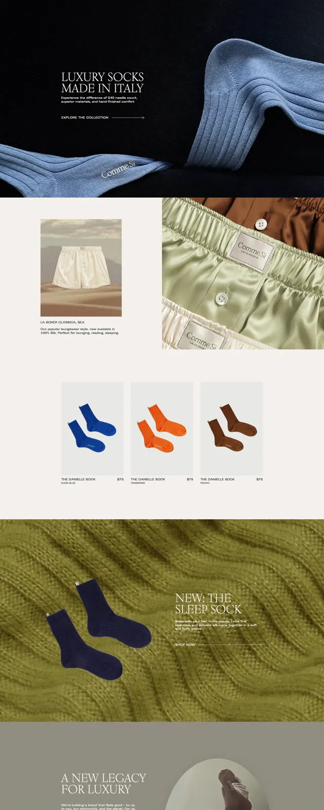
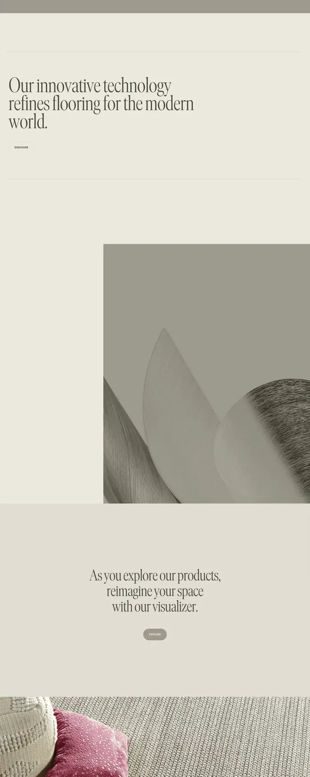
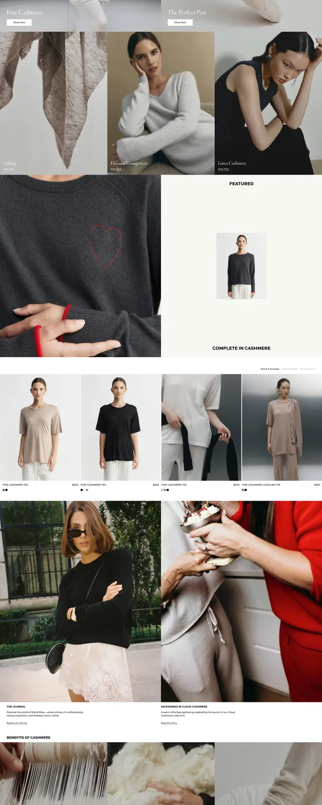
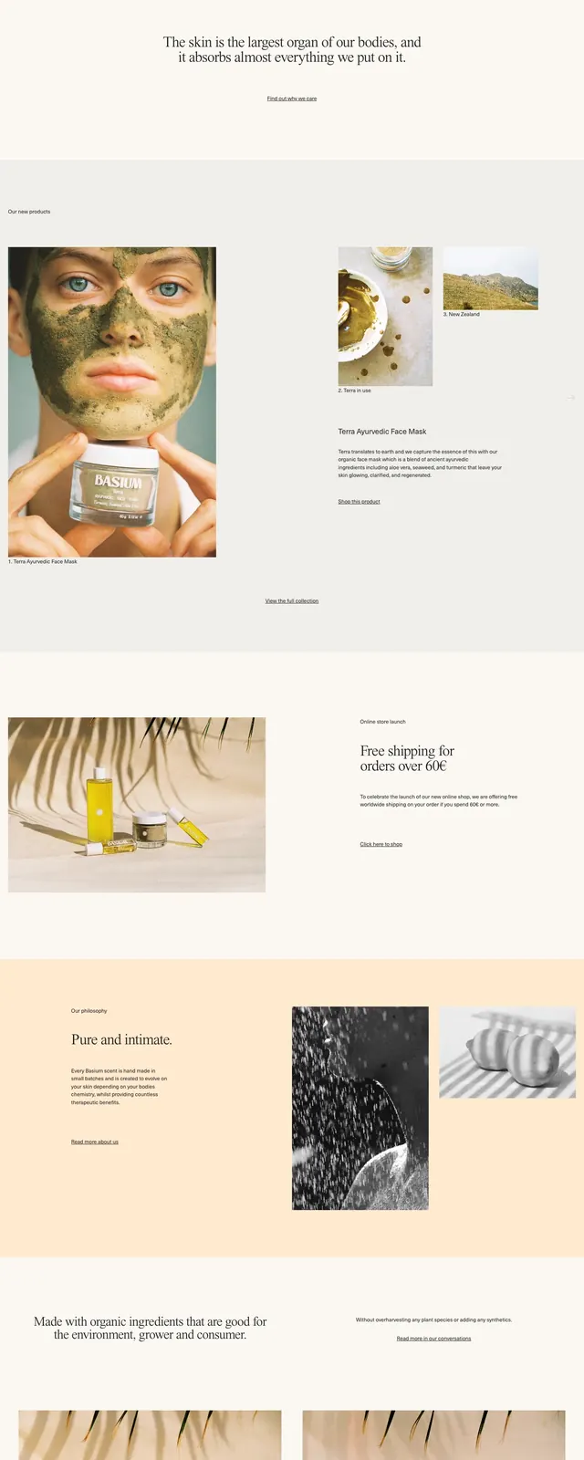
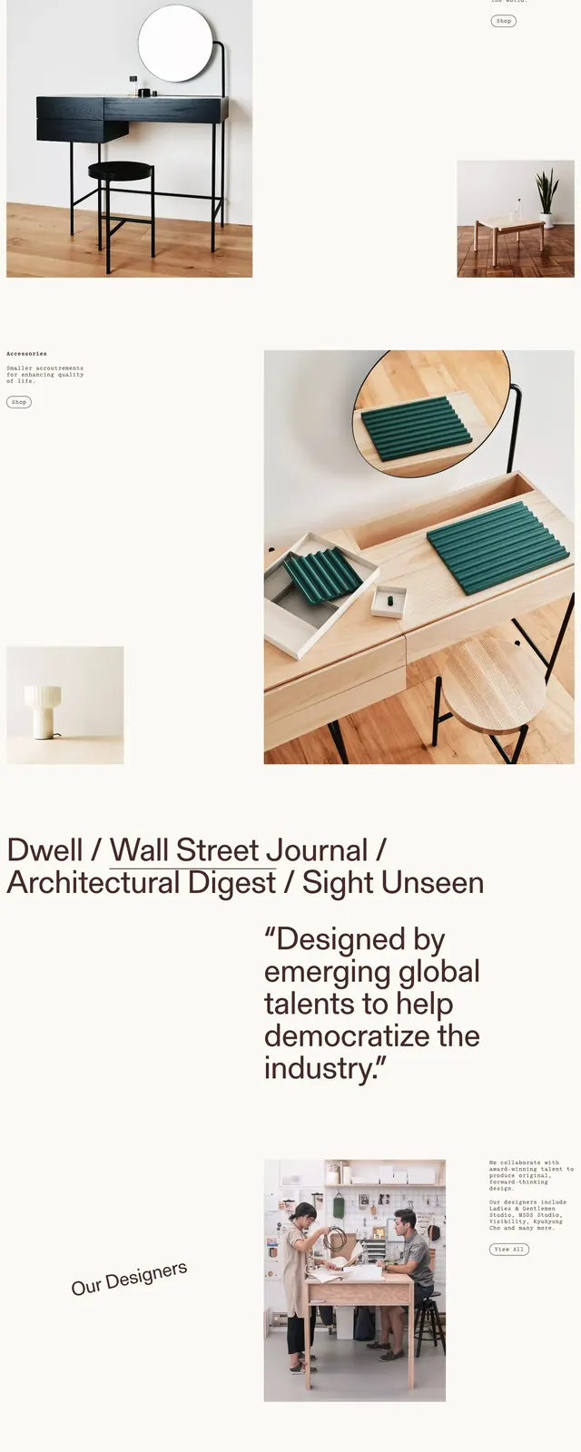
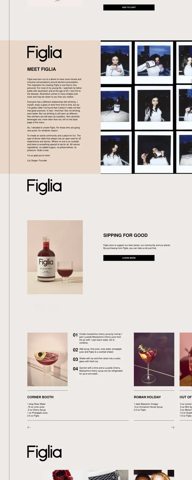
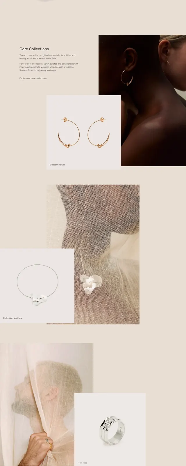
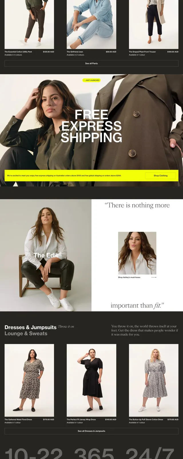
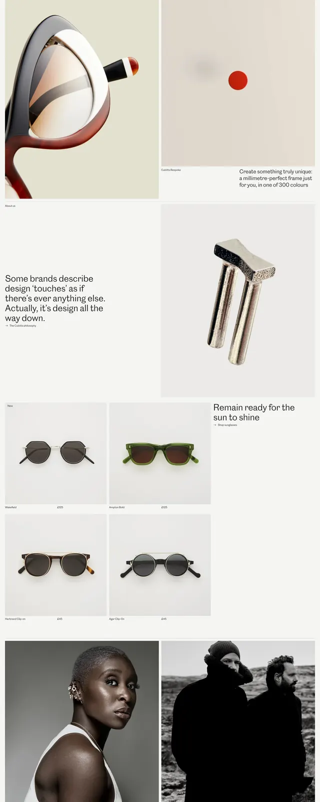
The page opens with a slim top navigation and two large portrait images in a clean editorial grid. Below, oversized left-aligned headlines sit beside framed product cards showing eyeglass frames on pale backgrounds. Further down, the layout alternates between manifesto-style copy blocks, more product tiles, and large store/interior photography with a soft cream and blush palette.
Key takeaway
The design relies on restraint, whitespace, and premium photography to make eyewear feel like a fashion and design object. It balances storytelling and commerce without visual clutter.
Reuse notes
Use this pattern for high-end product brands that need a calm, gallery-like shopping experience. The strongest reusable elements are the sparse nav, large editorial hero imagery, and modular product cards with minimal labeling.