Preview image. Unlock full-res
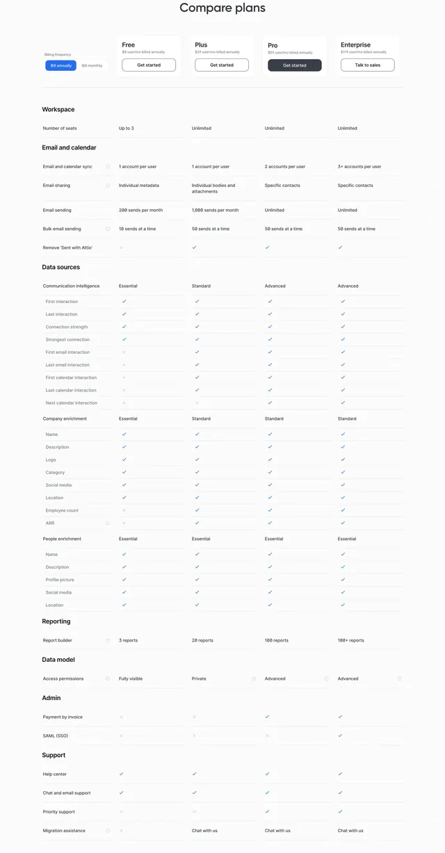
Light pricing comparison with annual toggle, four plan price headers, and a long feature matrix grouped by workspace, email, data, reporting, and support.
Summary
Compare plans section with billing frequency toggle, Free Plus Pro Enterprise price cards, and detailed category matrix using checkmarks and X marks.
Visual description
White background with centered Compare plans heading. Left billing frequency toggle shows Bill annually selected in blue versus Bill monthly. Four plan columns across top: Free $0, Plus $29, Pro $59, Enterprise $119 per user per month billed annually, each with Get started outline buttons except dark filled Pro and Enterprise Talk to sales. Long comparison table groups rows under Workspace, Email and calendar, Data sources with Communication intelligence Company enrichment and People enrichment subsections, Reporting, Data model, Admin, and Support. Cells use text limits, blue checkmarks, gray X marks, and small info icons beside select features like SAML SSO and migration assistance.
Key takeaway
Sticky-style plan headers aligned to a categorized matrix lets technical buyers audit enrichment depth without separate spec pages. Annual toggle beside the table keeps price context tied to feature rows.
Reuse notes
Best for B2B SaaS with many differentiated data features. Table is inherently long; consider sticky column headers and collapsible categories for mobile implementations.
More pricing table sections
See all
More like this

Keep what you find
A free account saves references to boards and can send you a weekly email of picks based on what you save.
To see every result, go Pro.