Preview image. Unlock full-res
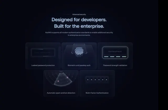
Dark centered security section with enterprise headline and five glowing feature cards in a three-over-two grid.
Summary
AuthKit's advanced security block leads with a flanked eyebrow and enterprise headline, then five dark glass cards each illustrating a specific auth safeguard.
Visual description
Dark navy background with centered white copy. Small "Advanced security" label sits between thin horizontal rules. Large headline: "Designed for developers. Built for the enterprise." Subhead explains support for modern authentication standards. Below, five rounded dark cards with subtle borders form a 3+2 grid. Each card has a glowing illustrative icon above a white label: leaked password protection (blurred credential string), biometric and passkey auth (fingerprint on a platform), password strength validation (input with green bar), automatic spam and bot detection (radar with pink blips), and multi-factor authentication (six OTP dots). Accents use cyan, green, and pink glows against the dark cards.
Key takeaway
One abstract micro-illustration per security feature keeps a dense grid scannable. The glowing icon treatment makes abstract enterprise capabilities feel tangible.
Reuse notes
Strong for auth, identity, or security SaaS feature bands. Requires custom icon art per feature; without glow discipline the cards can feel noisy on lighter themes.