Preview image. Unlock full-res
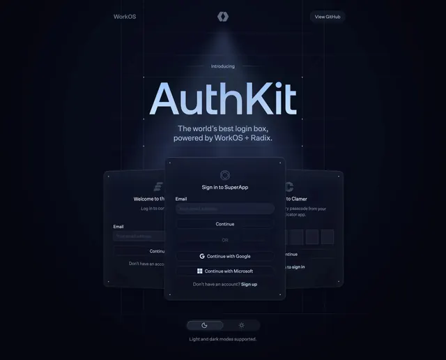
Dark AuthKit hero with spotlight grid, dotted crop marks around the wordmark, and a stacked trio of translucent login UI cards.
Summary
AuthKit introduces itself with a conical spotlight over a grid, oversized light-blue wordmark in design-crop marks, and three layered sign-in cards showing email, welcome, and OTP states.
Visual description
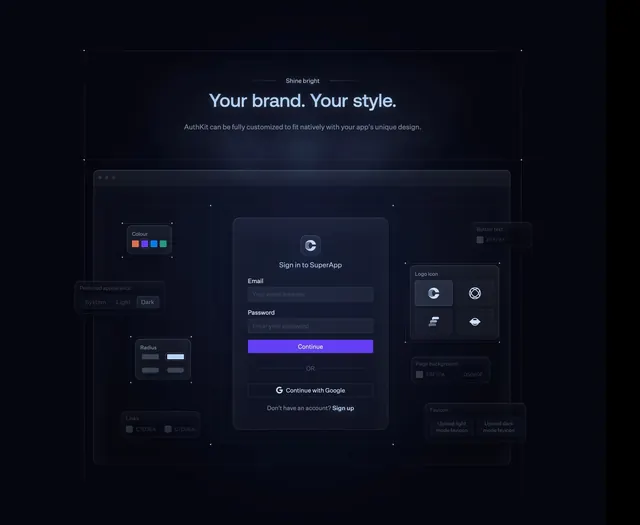
Deep navy-to-black gradient with a faint grid and soft top-center spotlight. Top bar shows WorkOS wordmark left, small hex icon center, and outlined "View GitHub" pill right. Centered eyebrow "Introducing" precedes large light-blue "AuthKit" framed by dotted corner crop marks. Subhead reads "The world's best login box, powered by WorkOS + Radix." Below, three dark translucent login cards stack in perspective: front card is a full "Sign in to SuperApp" form with email field, Continue button, OR divider, Google and Microsoft social buttons, and sign-up link; rear cards show a welcome state and a six-digit passcode input, blurred and angled. Bottom center has a dark/light mode pill toggle with moon and sun icons and caption "Light and dark modes supported."
Key takeaway
Showing multiple auth states as a physical card stack makes one component feel like a full system. The crop-mark frame around the product name signals design-tool polish without clutter.
Reuse notes
Ideal for developer-facing auth or component libraries. Needs high-fidelity UI mocks; the spotlight and stack lose impact on small screens without simplification.