Preview image. Unlock full-res
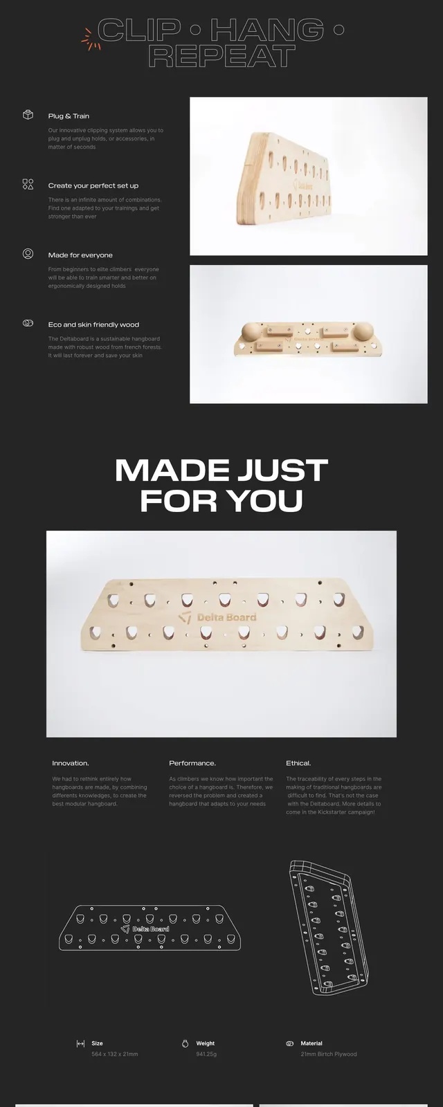
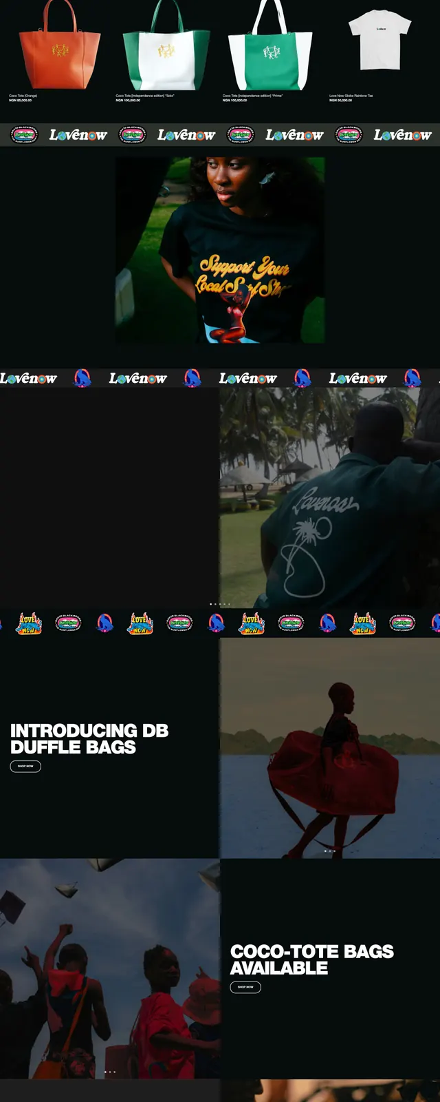
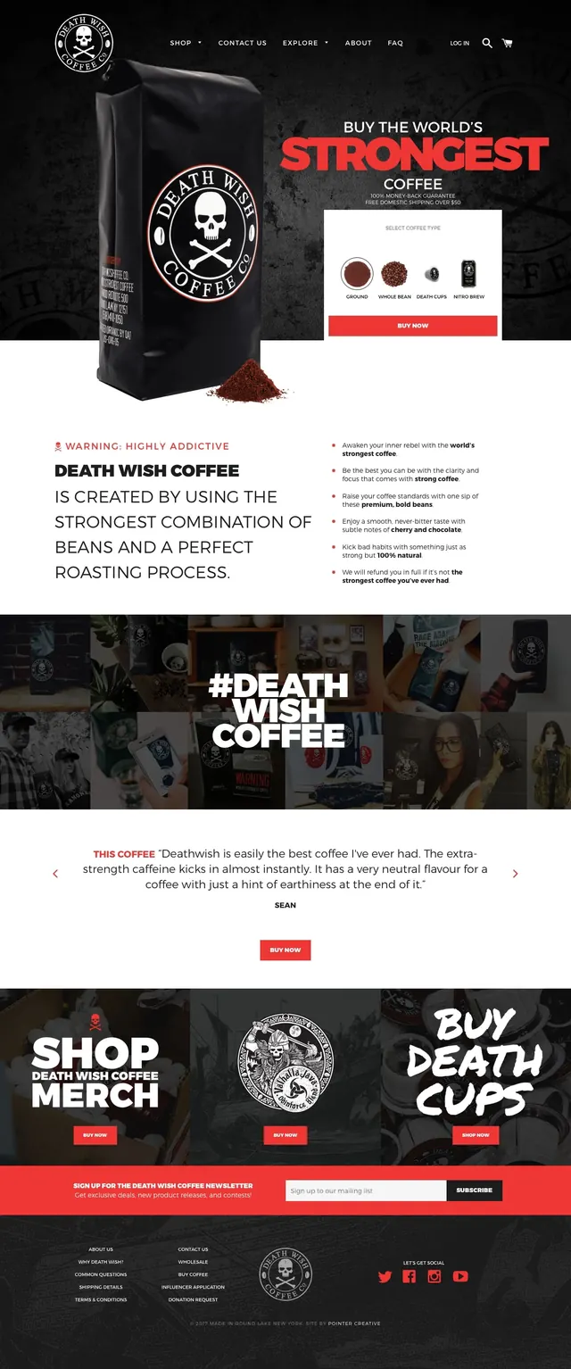
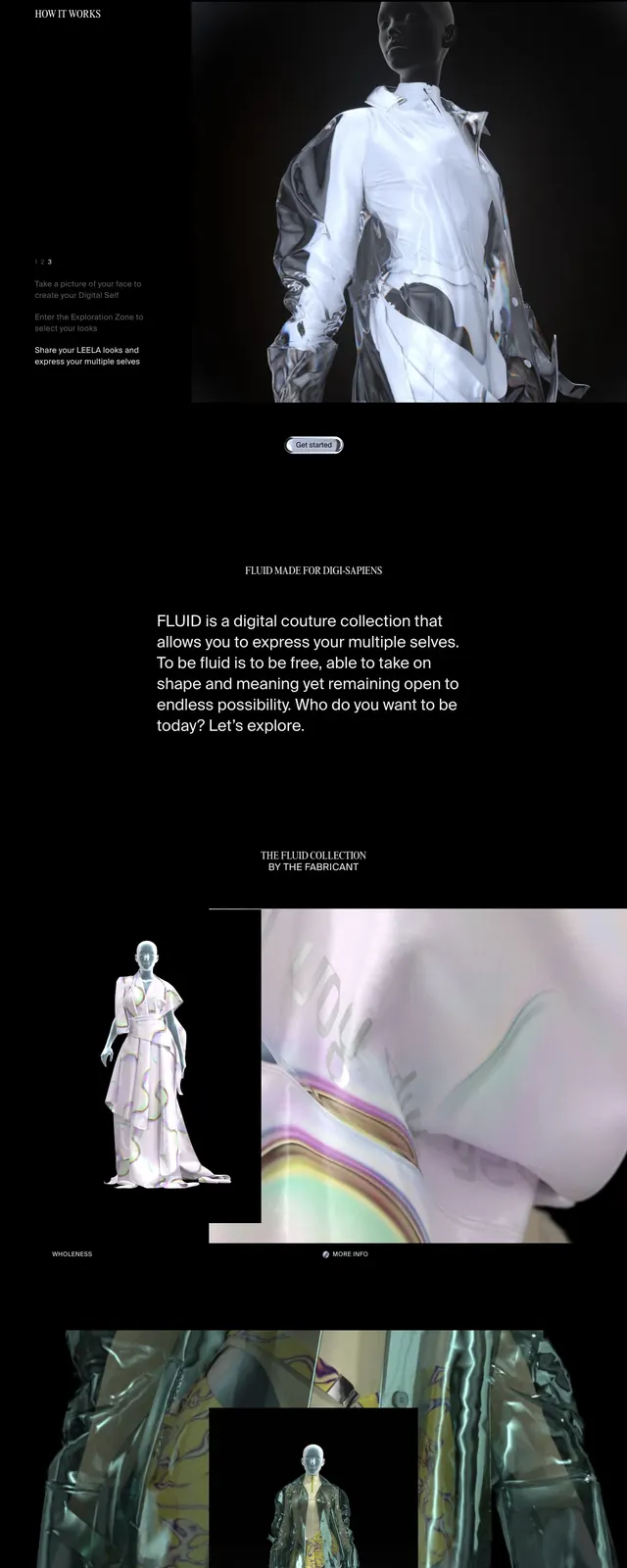
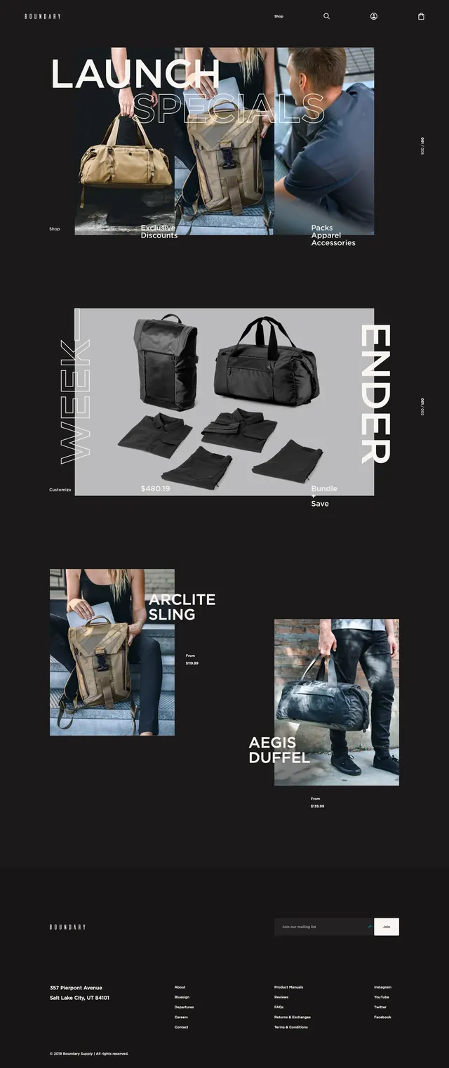
A dark, editorial ecommerce homepage for Boundary Supply with oversized promo messaging, large product imagery, and stacked product feature blocks.
Summary
A dark, editorial ecommerce homepage for Boundary Supply with oversized promo messaging, large product imagery, and stacked product feature blocks.
Visual description
The page uses a deep black background with small white navigation and logo elements at the top. The first screen is a large promo hero with oversized white and outlined headline text layered over three vertical product photos. Below, wide product showcase blocks alternate between dark and light panels, with bold vertical side labels, centered product cutouts, and scattered price text. The page ends with a minimal footer containing the brand mark, address, link columns, and a compact email signup field.
Key takeaway
The strongest move is the combination of editorial typography and product-forward photography against a nearly black canvas. Large, layered headlines create energy without adding visual clutter.
Reuse notes
Works well for premium ecommerce brands that want a fashion-editorial feel rather than a standard storefront. Best when the product photography is strong enough to carry large cropped layouts and asymmetrical stacking.