Preview image. Unlock full-res
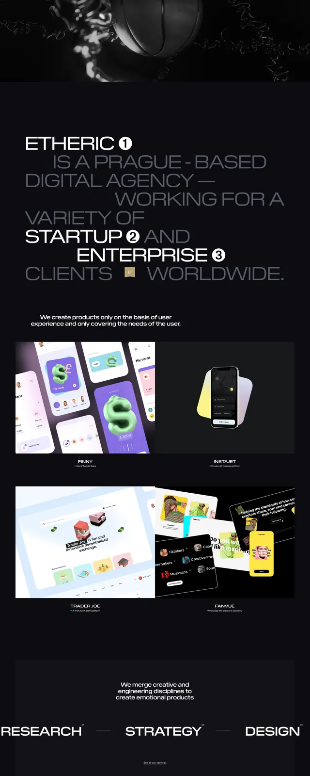
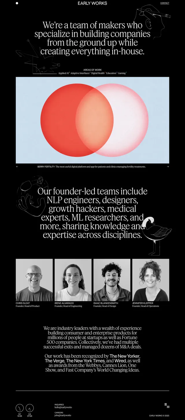
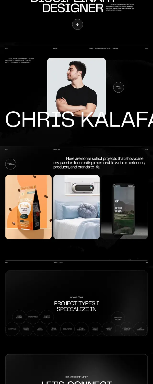
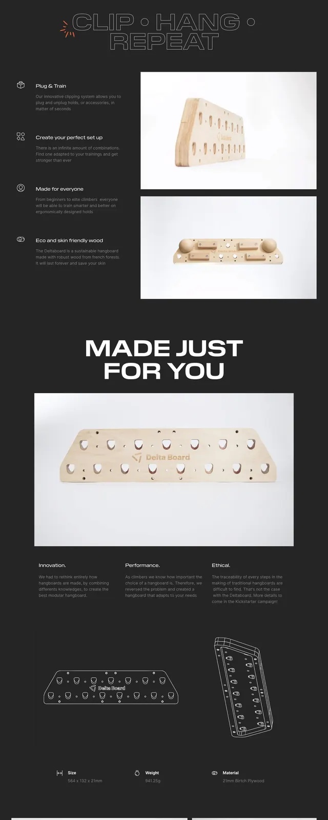
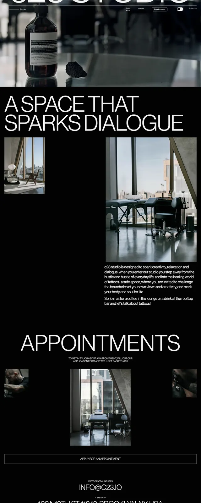
A dark, editorial tattoo studio landing page with oversized white typography, full-bleed photography, and sparse appointment-focused navigation.
Summary
A dark, editorial tattoo studio landing page with oversized white typography, full-bleed photography, and sparse appointment-focused navigation.
Visual description
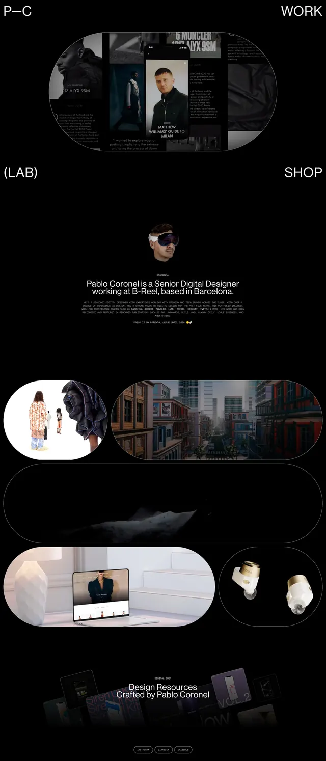
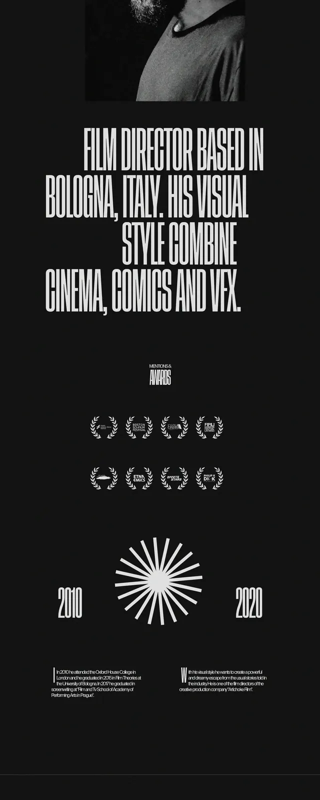
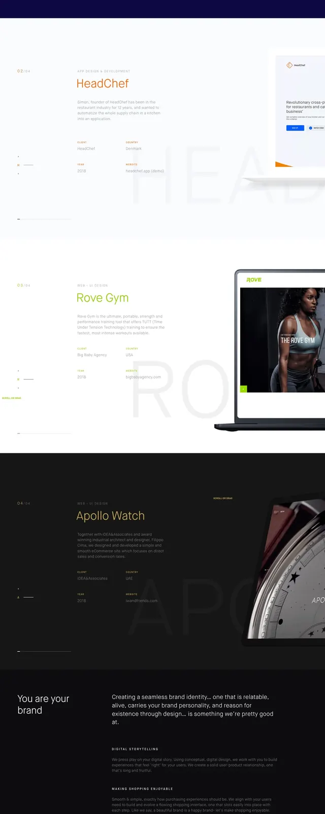
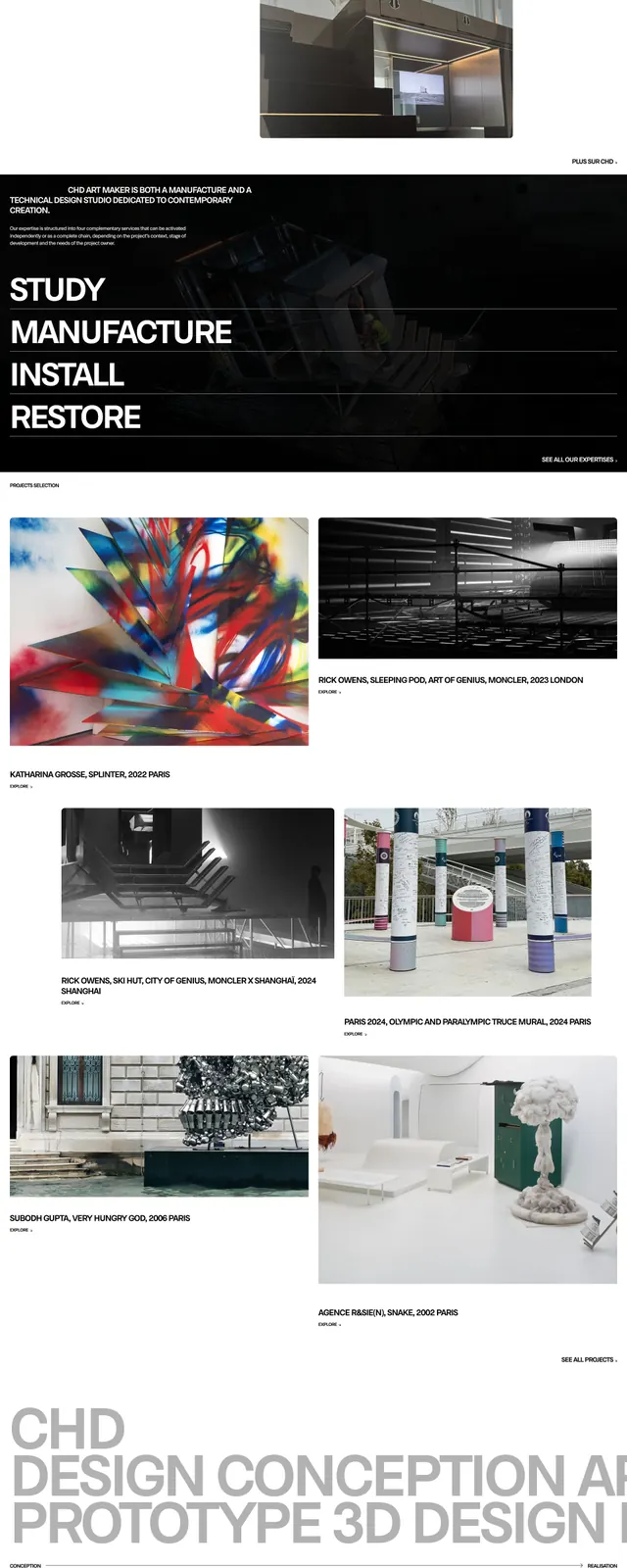
The page uses a stark black background with very large white all-caps headlines and thin, minimal navigation near the top. A full-width photographic hero shows a dark bottle and studio surface, followed by a large text-led section with smaller inset interior images and a paragraph of body copy aligned to the right. Lower on the page, an oversized "APPOINTMENTS" heading overlaps the section edge above a centered image and a wide outlined apply button, with contact information and address locked to the bottom.
Key takeaway
The strongest move is the contrast between oversized editorial type and quiet, gallery-style photography on a near-black canvas. The layout feels luxurious and intentional because the spacing is sparse and every CTA is visually restrained.
Reuse notes
Use this pattern for premium service brands that want a fashion-editorial feel with clear booking intent. It works best when the imagery is strong and the interface can stay minimal, especially on dark backgrounds.