Preview image. Unlock full-res
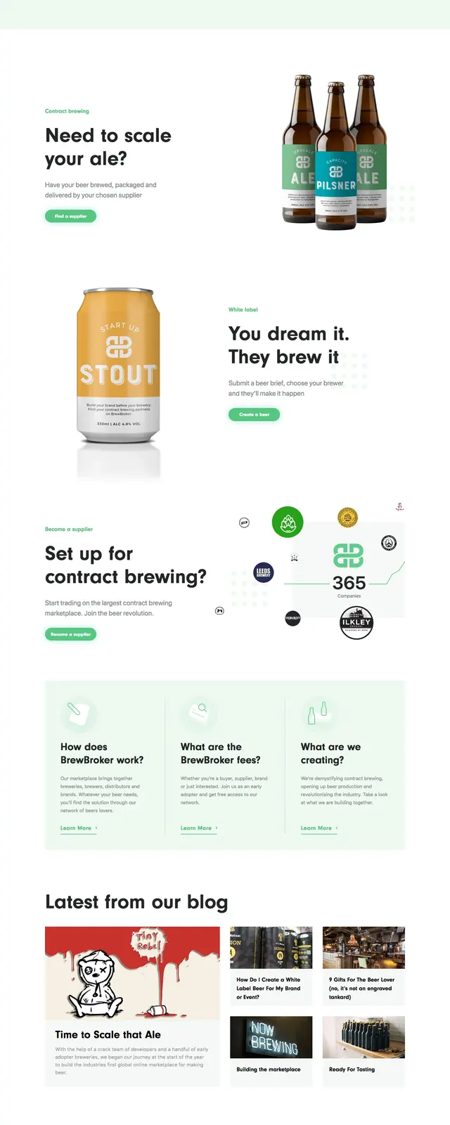
A soft green, product-led marketplace landing page for connecting brewers and suppliers through a clean editorial layout and bold beer imagery.
Summary
A soft green, product-led marketplace landing page for connecting brewers and suppliers through a clean editorial layout and bold beer imagery.
Visual description
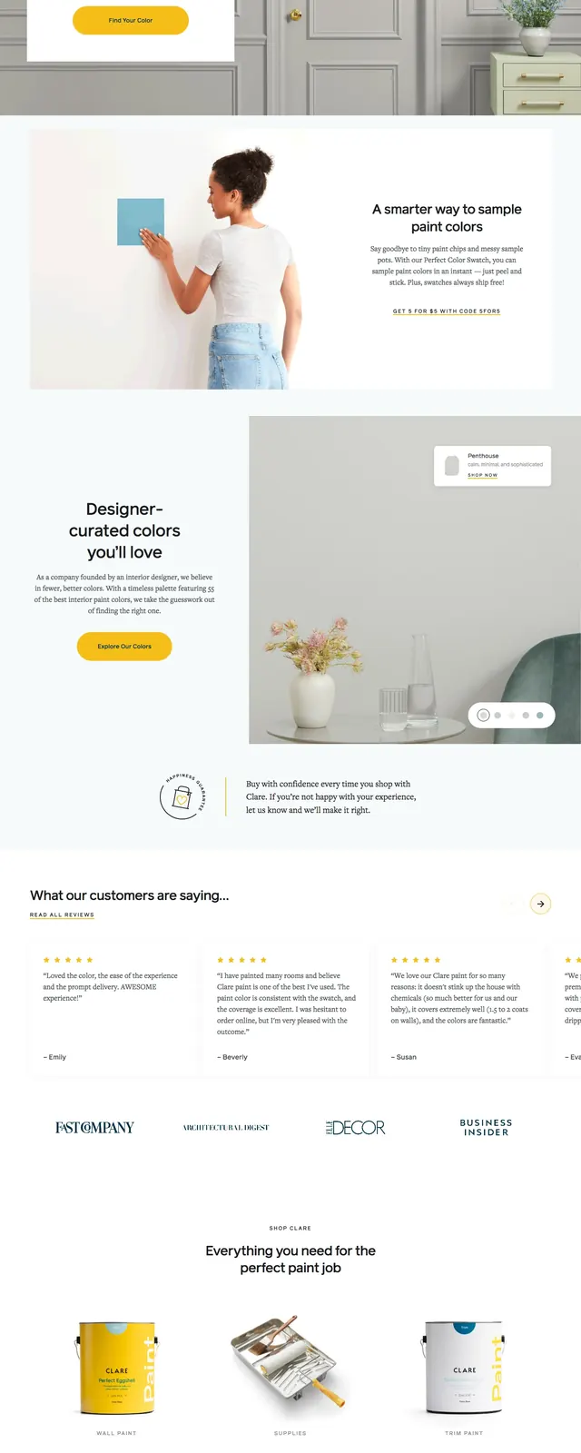
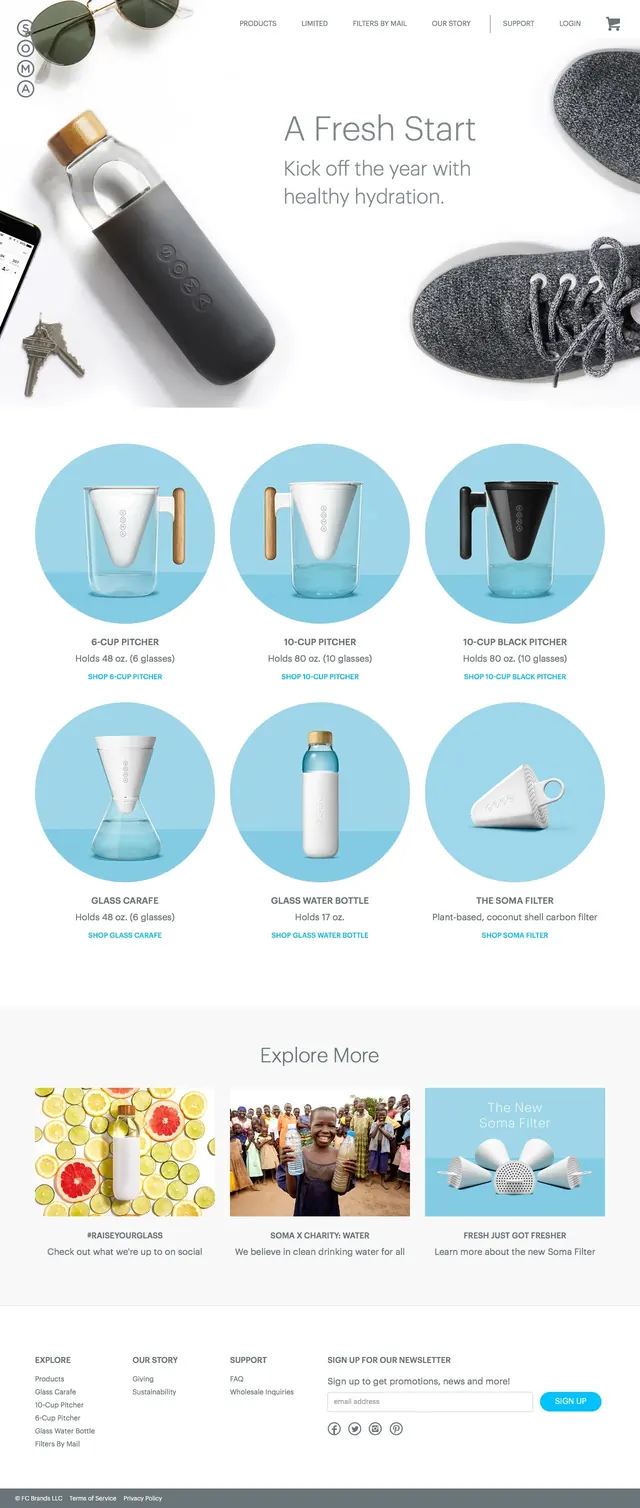
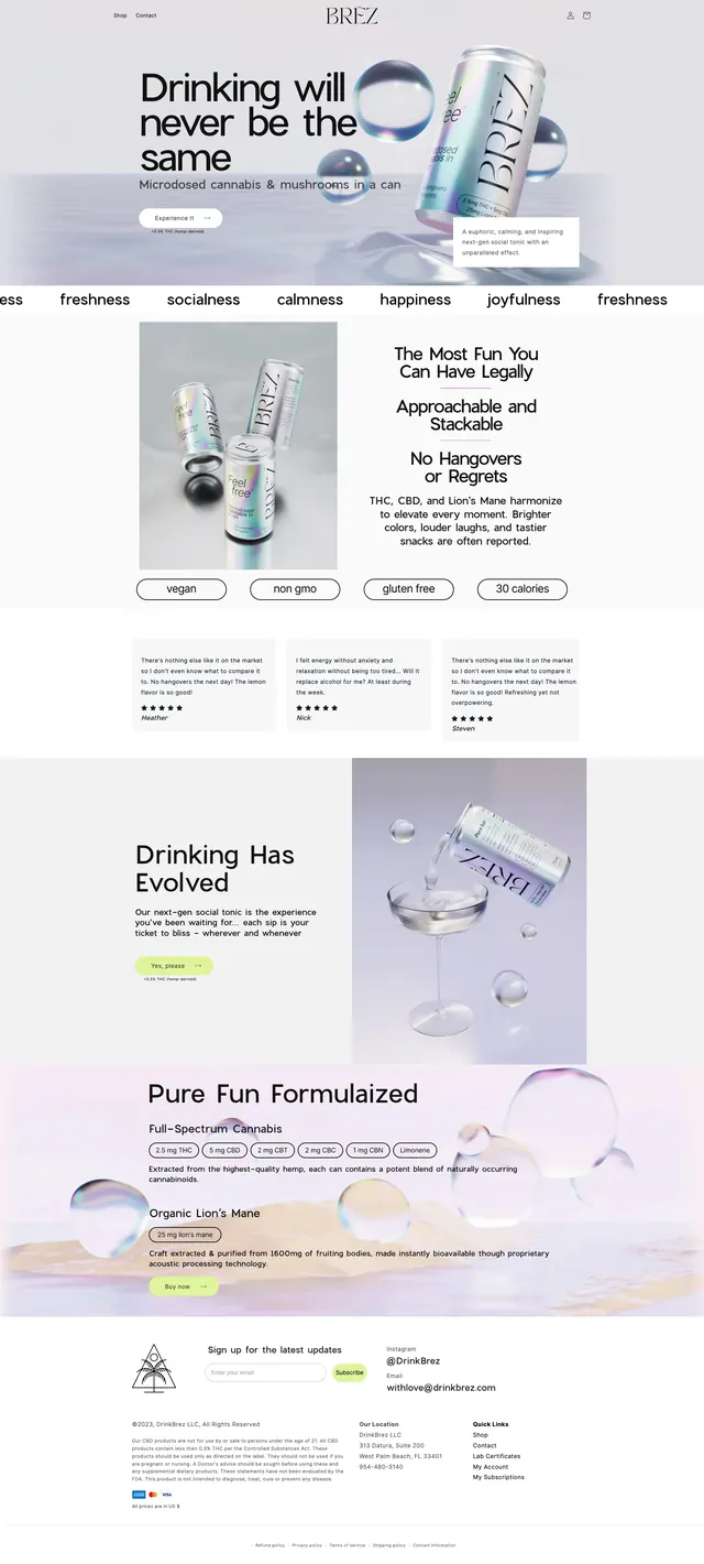
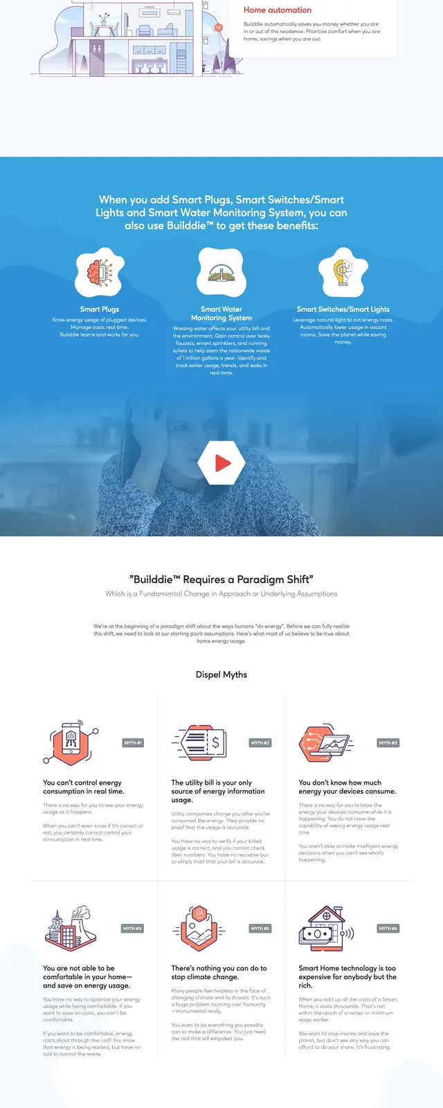
The page uses a pale mint background with large black headline typography and a split hero composition. On the right, realistic beer bottles and cans are arranged as product imagery with subtle decorative dots and soft shadows. Lower sections alternate between large promotional blocks, supplier-focused messaging, logo clusters, and a bento-style content grid. The overall feel is airy, spacious, and highly brand-centric with strong visual hierarchy.
Key takeaway
The strongest pattern is a clean marketplace hero paired with premium product photography and minimal navigation. It is effective for brands that need to feel approachable while still looking established and commercial.
Reuse notes
Reuse the split hero structure when you want a headline, short supporting copy, and a product cluster to do most of the selling. The mint palette, rounded buttons, and generous whitespace make it easy to adapt for other marketplace or B2B supply platforms.